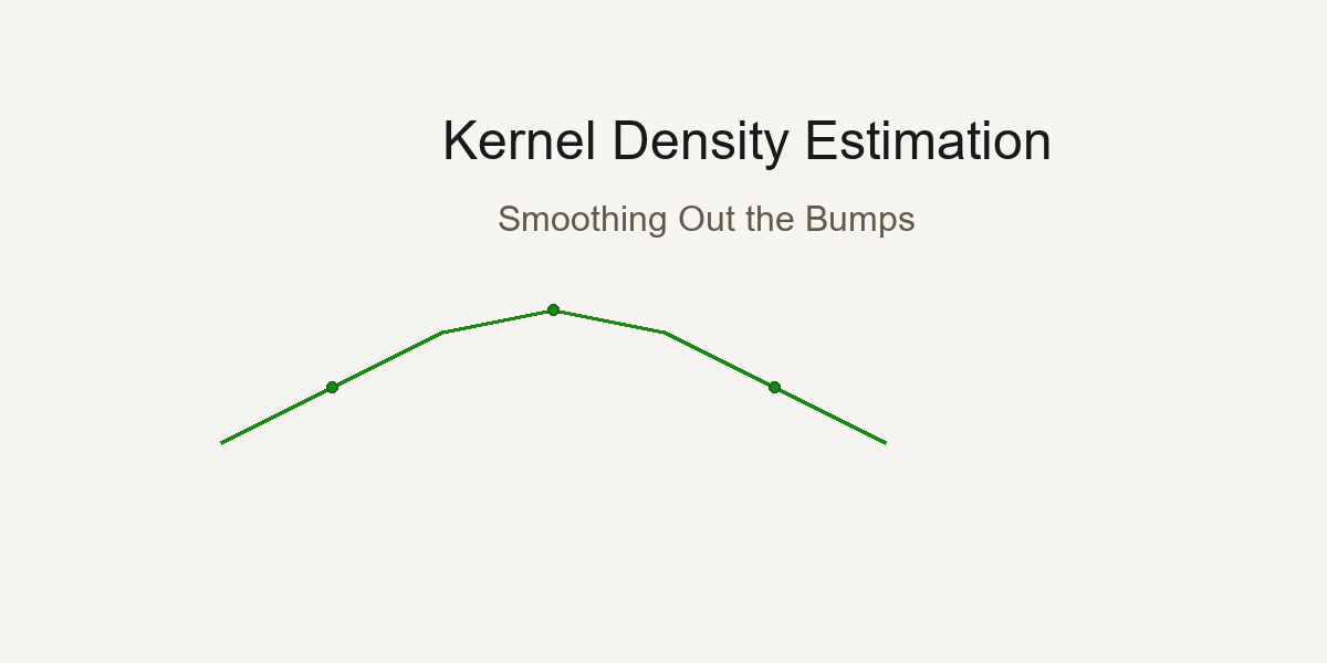
Day 11 — Kernel Density Estimation: Smoothing Out the Bumps
Every data point tells a story; KDE weaves them into a smooth narrative.
Kernel Density Estimation creates smooth distributions by placing a kernel at each data point and summing them together.
The Histogram Problem: Too Blocky, Too Sensitive
Imagine you're analyzing the heights of 100 people. You create a histogram:
Show code (9 lines)
Count

8
6
4
2
→ Height
5'0" 5'4" 5'8" 6'0" 6'4"
Problems:
- Blocky - Real height distribution is smooth, not stepwise
- Bin-dependent - Move bins by 2 inches, get a completely different picture!
- Hard to compare - Overlay two histograms? Messy!
Meet Kernel Density Estimation (KDE): The smooth, elegant solution.
The Big Idea: Every Point is a Little Hill
Instead of dropping data into bins, KDE says:
"Let's place a small, smooth hill (kernel) at each data point, then add them all up!"
Visual Intuition
Data points: [2, 3, 5, 8, 9]
Step 1: Place a "bell curve" at each point
Density

→ Value
2  3  5     8  9
Step 2: Add them all together
Density

→ Value
2  3  5     8  9
Result: A smooth, continuous density curve!
The Math: Kernels and Bandwidth
The KDE Formula
For data points x₁, x₂, ..., xₙ, the density at any point x is:
f̂(x) = (1/n) Σᵢ₌₁ⁿ K((x - xᵢ)/h)
Breaking it down:
- f̂(x) = estimated density at point x
- n = number of data points
- K(·) = kernel function (usually Gaussian/normal curve)
- xᵢ = the i-th data point
- h = bandwidth (controls width of each hill)
- (x - xᵢ)/h = how far x is from xᵢ, scaled by bandwidth
The Gaussian Kernel (Most Common)
K(u) = (1/√(2π)) × exp(-u²/2)
This is just a standard normal distribution!
In full:
f̂(x) = (1/(n×h×√(2π))) × Σᵢ₌₁ⁿ exp(-(x - xᵢ)²/(2h²))
Translation: Place a normal curve with standard deviation h at each data point, add them up, normalize by n.
Other Kernel Options
While Gaussian is most popular, you can use different "hill shapes":
Epanechnikov (most efficient):
K(u) = (3/4)(1 - u²)  if |u| ≤ 1, else 0

Shape:  (parabolic hump)
Uniform (box):
K(u) = 1/2  if |u| ≤ 1, else 0

Shape:  (flat top)
Triangular:
K(u) = 1 - |u|  if |u| ≤ 1, else 0

Shape: /\ (triangle)
Good news: Kernel choice matters much less than bandwidth choice! Usually just stick with Gaussian.
The Critical Choice: Bandwidth (h)
Bandwidth is the most important parameter in KDE. It controls how smooth your curve is.
Small Bandwidth (Undersmoothing)
Show code (9 lines)
h = 0.1 (very small)

Density

→ Value

Too wiggly! Shows every tiny bump.
Might be capturing noise, not signal.
Problems:
- High variance (changes a lot with different samples)
- Overfitting (capturing random fluctuations)
- Hard to see the overall pattern
Large Bandwidth (Oversmoothing)
Show code (9 lines)
h = 5.0 (very large)

Density

→ Value

Too smooth! Hides important features.
Might miss real peaks.
Problems:
- High bias (systematic error)
- Underfitting (missing real structure)
- Might hide multimodality (multiple peaks)
Just Right Bandwidth
Show code (9 lines)
h = 0.5 (just right)

Density

→ Value

Smooth enough to see the pattern,
detailed enough to catch real features!
The Bias-Variance Tradeoff
This is one of the most fundamental concepts in statistics and machine learning!
Mathematical Formulation
Mean Squared Error (MSE) at point x:
MSE(x) = E[(f̂(x) - f(x))²]
= Bias²(x) + Variance(x)
Where:
- f̂(x) = our KDE estimate
- f(x) = true (unknown) density
- E[·] = expected value (average over many samples)
Bias:
Bias(x) = E[f̂(x)] - f(x)
Systematic error from smoothing
Variance:
Variance(x) = E[(f̂(x) - E[f̂(x)])²]
Random error from finite sample
The Bandwidth Effect
Small h:
- Low bias (follows data closely)
- High variance (jumps around with different samples)
- Result: Overfit - looks great on this sample, terrible on new data
Large h:
- High bias (oversmooths, misses features)
- Low variance (stable across samples)
- Result: Underfit - consistent but systematically wrong
Optimal h:
- Balances both
- Minimizes total MSE
Visual Representation
Show code (11 lines)
Error

Total MSE

Bias²

______  Variance

→ Bandwidth (h)
small  optimal  large
Silverman's Rule of Thumb
How do we choose h? Silverman's rule gives us a data-driven default:
h = 0.9 × min(σ, IQR/1.34) × n^(-1/5)
Breaking it down:
σ = standard deviation of data
IQR = interquartile range (Q₃ - Q₁)
n = sample size
min(σ, IQR/1.34) = robust estimate of spread (protects against outliers)
n^(-1/5) = sample size adjustment (more data → smaller bandwidth)
Why This Formula?
The IQR/1.34 part:
For normal distribution, IQR ≈ 1.34σ. Using min(σ, IQR/1.34) gives us:
- σ if data is normal
- IQR/1.34 if data has outliers (more robust!)
The n^(-1/5) part:
Comes from minimizing asymptotic MSE. As sample size grows:
- n = 100 → n^(-1/5) = 0.398
- n = 1000 → n^(-1/5) = 0.251
- n = 10000 → n^(-1/5) = 0.158
More data → tighter bandwidth (can afford more detail)
The 0.9 constant:
Empirically tuned for Gaussian kernels to work well in practice.
Example Calculation
Data: [5, 6, 7, 8, 9, 10, 11, 12, 13, 14] (n=10)
Show code (10 lines)
Mean = 9.5
σ = √[(Σ(xᵢ - 9.5)²)/10] = 2.87
Q₁ = 6.75, Q₃ = 12.25
IQR = 12.25 - 6.75 = 5.5
IQR/1.34 = 4.10
min(2.87, 4.10) = 2.87
h = 0.9 × 2.87 × 10^(-1/5)
= 0.9 × 2.87 × 0.631
= 1.63
Bandwidth ≈ 1.63
Alternative Bandwidth Selection Methods
Scott's Rule
h = σ × n^(-1/(d+4))
Where d = number of dimensions (usually 1 for univariate KDE)
For 1D: h = σ × n^(-1/5) (simpler than Silverman!)
Plug-in Methods
Use calculus to estimate optimal h based on second derivative of true density (computationally intensive but more accurate)
Cross-Validation
Try many h values, pick the one that best predicts held-out data (most accurate but slowest)
In practice: Silverman's rule works great 90% of the time!
Comparing Groups: The Power of Overlaid KDEs
This is where KDE really shines! Let's compare "Effective" vs "Non-Effective" treatments.
The Data
Effective Group: [65, 70, 72, 75, 78, 80, 82, 85, 87, 90]
Non-Effective Group: [45, 48, 50, 52, 55, 58, 60, 62, 65, 68]
Histogram Comparison (Messy)
Count

→ Value
40  60  80  100
= Non-Effective
= Effective
Hard to compare! Bins don't align, overlaps confusing.
KDE Comparison (Beautiful)
Density

→ Value
40  60  80  100
Non-Effective (shifted left)
Effective (shifted right)
Insights instantly visible:
- Effective group centered ~15 points higher
- Similar spread (variance)
- Both roughly normal
- Minimal overlap (~10%)
Exercise: How Bandwidth Hides Multimodality
Let's explore a dataset with TWO distinct groups that we want to discover.
The Data: Hidden Bimodal Distribution
Data: [10, 11, 12, 13, 14, 15, 50, 51, 52, 53, 54, 55]
Two clear clusters: one around 12, one around 52.
Small Bandwidth (h = 1.0) - Truth Revealed
Density

________
→ Value
10  20  30  40  50  60
Two peaks clearly visible! This is bimodal data.
Calculation at x = 12 (first peak):
Show code (11 lines)
f̂(12) = (1/(12×1×√(2π))) × [
exp(-(12-10)²/2) +
exp(-(12-11)²/2) +
exp(-(12-12)²/2) +  ← Highest contribution
exp(-(12-13)²/2) +
exp(-(12-14)²/2) +
exp(-(12-15)²/2) +
exp(-(12-50)²/2) +  ← Near zero
... (far points contribute ~0)
]
Medium Bandwidth (h = 5.0) - Hints of Structure
Density

____

→ Value
10  20  30  40  50  60
Still see two bumps, but the valley between is shallower. Starting to blur together.
Large Bandwidth (h = 15.0) - Truth Hidden!
Density

→ Value
10  20  30  40  50  60
One smooth hump! The bimodality is completely hidden.
You'd conclude this is unimodal (one group) when it's actually two distinct populations!
Very Large Bandwidth (h = 30.0) - Maximum Blur
Density

→ Value
10  20  30  40  50  60
So smooth it's nearly flat! All information lost.
The Lesson: Bandwidth is Critical!
Too small: See noise as signal (false peaks)
Too large: Miss real structure (hidden modes)
Just right: Reveal true patterns
Pro tip: Always try multiple bandwidths when exploring new data! Start with Silverman's rule, then explore ±50%.
Practical Implementation
Python with scipy
Show code (32 lines)
from scipy.stats import gaussian_kde
import numpy as np

# Your data
effective = [65, 70, 72, 75, 78, 80, 82, 85, 87, 90]
non_effective = [45, 48, 50, 52, 55, 58, 60, 62, 65, 68]

# Create KDE objects (uses Silverman's rule by default)
kde_eff = gaussian_kde(effective)
kde_non = gaussian_kde(non_effective)

# Or specify bandwidth manually
kde_eff = gaussian_kde(effective, bw_method=0.5)  # h = 0.5

# Evaluate on a grid
x_grid = np.linspace(40, 100, 1000)
density_eff = kde_eff(x_grid)
density_non = kde_non(x_grid)

# Plot
import matplotlib.pyplot as plt

plt.plot(x_grid, density_eff, label='Effective', color='green')
plt.plot(x_grid, density_non, label='Non-Effective', color='red')
plt.fill_between(x_grid, density_eff, alpha=0.3, color='green')
plt.fill_between(x_grid, density_non, alpha=0.3, color='red')
plt.xlabel('Value')
plt.ylabel('Density')
plt.legend()
plt.title('KDE Comparison: Effective vs Non-Effective')
plt.show()
Adjusting Bandwidth
Show code (15 lines)
# Silverman's rule (default)
kde = gaussian_kde(data)

# Manual bandwidth
kde = gaussian_kde(data, bw_method=1.5)

# Scott's rule
kde = gaussian_kde(data, bw_method='scott')

# Custom function
def my_bandwidth(kde_object):
return 0.5 * kde_object.scotts_factor()

kde = gaussian_kde(data, bw_method=my_bandwidth)
Tie-Back: get_density_plots in Our Toolkit
Show code (48 lines)
def get_density_plots(effective_data, non_effective_data,
bandwidth='silverman'):
"""
Visualize density shifts between two groups

Parameters:
- effective_data: Array of values for effective group
- non_effective_data: Array for non-effective group
- bandwidth: 'silverman', 'scott', or float value

Returns: matplotlib figure showing overlaid KDEs
"""
# Create KDE for each group
kde_eff = gaussian_kde(effective_data, bw_method=bandwidth)
kde_non = gaussian_kde(non_effective_data, bw_method=bandwidth)

# Create evaluation grid
all_data = np.concatenate([effective_data, non_effective_data])
x_min, x_max = all_data.min(), all_data.max()
padding = (x_max - x_min) * 0.1
x_grid = np.linspace(x_min - padding, x_max + padding, 1000)

# Evaluate densities
dens_eff = kde_eff(x_grid)
dens_non = kde_non(x_grid)

# Plot with fills
fig, ax = plt.subplots(figsize=(10, 6))
ax.plot(x_grid, dens_eff, 'g-', linewidth=2, label='Effective')
ax.plot(x_grid, dens_non, 'r-', linewidth=2, label='Non-Effective')
ax.fill_between(x_grid, dens_eff, alpha=0.3, color='green')
ax.fill_between(x_grid, dens_non, alpha=0.3, color='red')

# Add rug plots (individual data points)
ax.plot(effective_data, np.zeros_like(effective_data),
'g|', markersize=10, alpha=0.5)
ax.plot(non_effective_data, np.zeros_like(non_effective_data),
'r|', markersize=10, alpha=0.5)

ax.set_xlabel('Value', fontsize=12)
ax.set_ylabel('Density', fontsize=12)
ax.set_title('Density Comparison: Treatment Effectiveness',
fontsize=14)
ax.legend()
ax.grid(alpha=0.3)

return fig
Use case: Medical trial data, A/B test results, before/after comparisons. Anywhere you need to see if distributions differ!
When to Use KDE vs Other Methods
Use KDE When:
Comparing distributions between groups
Need smooth, publication-quality plots
Exploring data shape (uni/bimodal, skewed, etc.)
Sample size is moderate to large (n > 30)
Want to estimate probability at any point
Use Histograms When:
Very large datasets (millions of points)
Need exact counts
Discrete data (coin flips, dice rolls)
Presenting to audiences unfamiliar with KDE
Use Box Plots When:
Want to highlight outliers specifically
Comparing many groups (5+)
Focus on quartiles, not full distribution shape
Don't Use KDE When:
Very small samples (n < 20) - too unreliable
Heavy outliers that might dominate bandwidth selection
Discrete data with few categories (use bar charts)
Advanced Topics
Multivariate KDE
KDE extends to 2D, 3D, etc.:
f̂(x, y) = (1/(n×h₁×h₂)) × Σᵢ K((x-xᵢ)/h₁, (y-yᵢ)/h₂)
Useful for visualizing 2D point clouds with contours!
Adaptive Bandwidth
Use different h for different regions:
- Narrow bandwidth where data is dense
- Wide bandwidth where data is sparse
More complex but can reveal local structure better.
Boundary Correction
KDE at edges (min/max of data) can be biased because the kernel "spills over" the boundary. Solutions:
- Reflection method
- Boundary kernels
- Truncation
Common Pitfalls
- Using default bandwidth blindly
- Always check! Plot with several h values
- Interpreting density as probability
- Density at x ≠ P(X = x)
- Probability requires integrating: P(a < X < b) = ∫ₐᵇ f̂(x)dx
- Comparing groups with different bandwidths
- Use same h for both groups or comparison is unfair!
- Over-interpreting small sample KDE
- n = 10? That KDE is very uncertain!
- Ignoring multimodality
- If you see multiple peaks, investigate! Could be important subgroups
Summary
Kernel Density Estimation transforms discrete data into smooth, continuous distributions:
Key Concepts:
KDE formula: f̂(x) = (1/nh) Σ K((x-xᵢ)/h)
Bandwidth h is critical - controls smoothness
Bias-variance tradeoff: small h (wiggly), large h (oversmoothed)
Silverman's rule: h = 0.9 × min(σ, IQR/1.34) × n^(-1/5)
Gaussian kernel most common: K(u) = exp(-u²/2)/√(2π)
Perfect for comparing groups - overlaid curves show shifts clearly
Watch for hidden modes - too much smoothing hides structure
The Beautiful Tradeoff:
Small bandwidth → See everything (including noise)
Large bandwidth → See nothing (smooth blur)
Optimal bandwidth → See truth (signal without noise)
Practical Wisdom:
Start with Silverman, explore ±50%
Always visualize with multiple bandwidths
Look for multimodality - it might be real!
Use color/fill for group comparisons
Report your bandwidth choice (reproducibility!)
Wrapping Up
Kernel Density Estimation gives you smooth, publication-ready visualizations that reveal the true shape of your data. Master bandwidth selection, understand the bias-variance tradeoff, and you'll have a powerful tool for comparing groups and exploring distributions. When histograms feel too blocky and box plots too summary, KDE is your elegant solution.
References
-
Silverman, B. W. (1986). Density Estimation for Statistics and Data Analysis. Chapman and Hall/CRC.
-
Scott, D. W. (1992). Multivariate Density Estimation: Theory, Practice, and Visualization. John Wiley & Sons.
-
Wand, M. P., & Jones, M. C. (1995). Kernel Smoothing. Chapman and Hall/CRC.
-
Sheather, S. J., & Jones, M. C. (1991). A reliable data-based bandwidth selection method for kernel density estimation. Journal of the Royal Statistical Society, Series B, 53(3), 683–690.
-
Epanechnikov, V. A. (1969). Non-parametric estimation of a multivariate probability density. Theory of Probability & Its Applications, 14(1), 153–158.
-
Rosenblatt, M. (1956). Remarks on some nonparametric estimates of a density function. The Annals of Mathematical Statistics, 27(3), 832–837.
-
Parzen, E. (1962). On estimation of a probability density function and mode. The Annals of Mathematical Statistics, 33(3), 1065–1076.
-
Jones, M. C., Marron, J. S., & Sheather, S. J. (1996). A brief survey of bandwidth selection for density estimation. Journal of the American Statistical Association, 91(433), 401–407.