Day 7 — Boxplots, IQR, and Tukey Fences
Introduction
How do you flag suspicious data points without assuming anything about the shape of your distribution? What if the mean and standard deviation are themselves warped by extremes? Boxplots answer both questions by leaning on the IQR (Interquartile Range) and Tukey fences — a method that's robust, visual, and works just as well on skewed or heavy-tailed data as it does on textbook bell curves.
The Goal
Find a rule-of-thumb for outliers that:
- Doesn't rely on the mean/SD (which break with extremes),
- Works on skewed or heavy-tailed data,
- Is visual, explainable, and easy to compute.
This is where Tukey fences come in — the engine behind every boxplot.
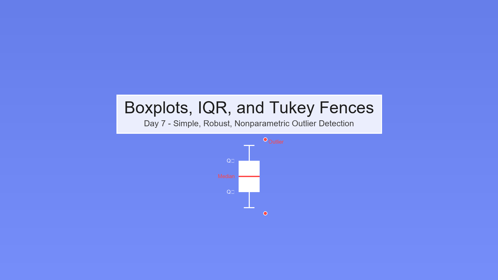
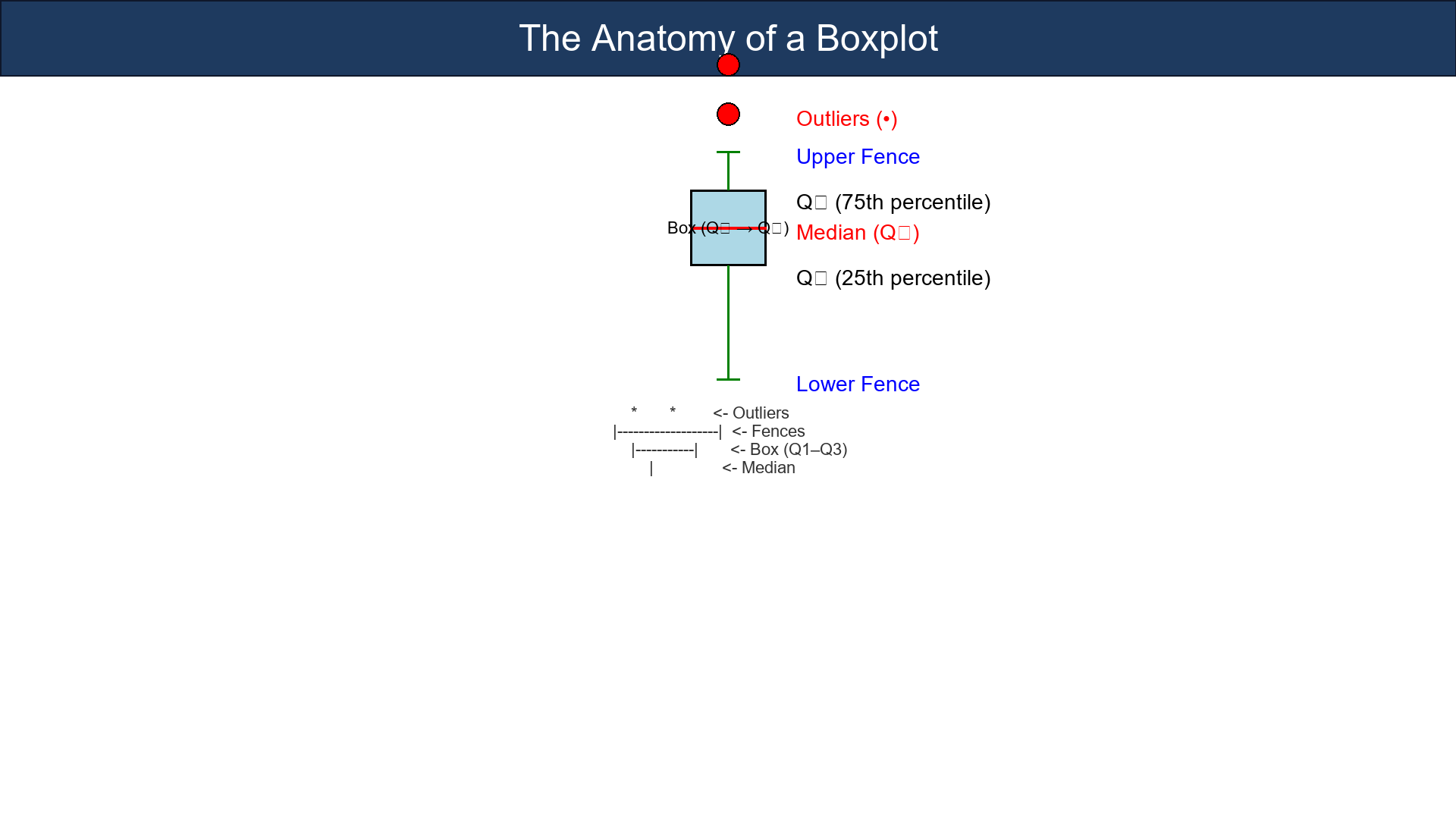
The Anatomy of a Boxplot
Think of your dataset as a landscape:
- The box = the middle 50% (Q₁ → Q₃).
- The line inside = the median (Q₂).
- The whiskers = data within the fences.
- The dots outside = outliers.
Here's the anatomy in plain terms:
* *        <- Outliers
|-------------------|  <- Fences
|-----------|       <- Box (Q1–Q3)
|               <- Median
The IQR measures the width of the box — how spread the middle half is.
- Larger IQR → more variability.
- Smaller IQR → tight clustering.
Tukey's inner and outer fences wrap the box to flag suspicious points.
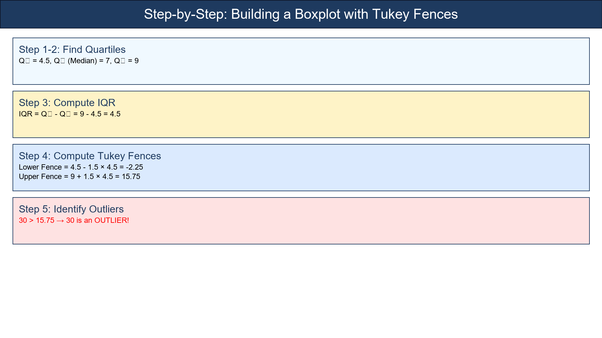
Step-by-Step Example
Let's take this simple dataset:
[3, 4, 5, 6, 7, 8, 9, 15, 30]
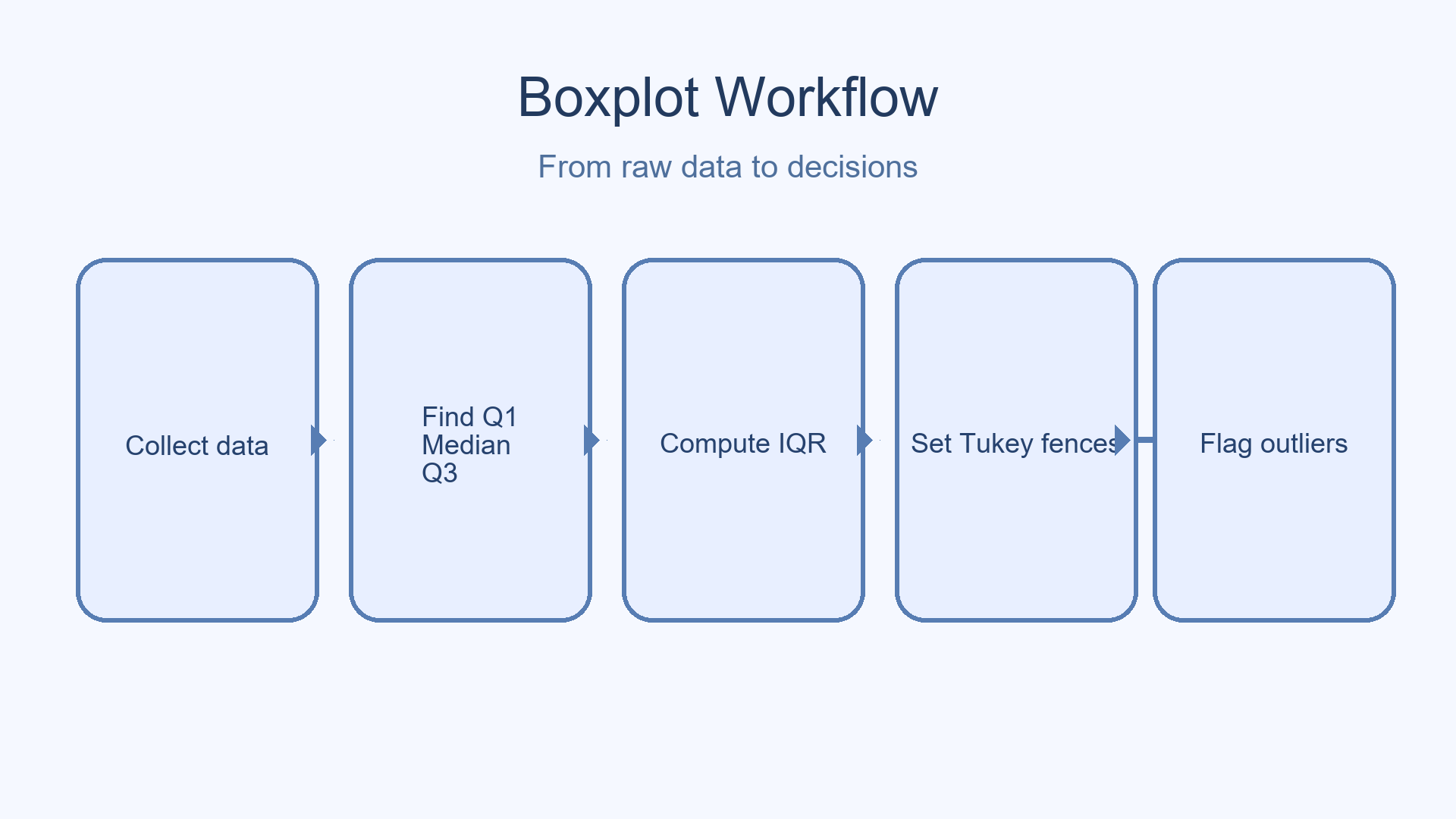
1. Sort it (already sorted).
2. Find quartiles:
- Q₁ = lower 25th percentile = 4.5
- Q₂ = median = 7
- Q₃ = upper 75th percentile = 9
3. Compute IQR:
4. Compute Tukey fences:
5. Flag outliers:
Any x < −2.25 or x > 15.75 is an outlier.
Here, 30 > 15.75, so 30 is an outlier.
That's it!
You've just built a nonparametric outlier detector — no mean, no SD, no assumptions.
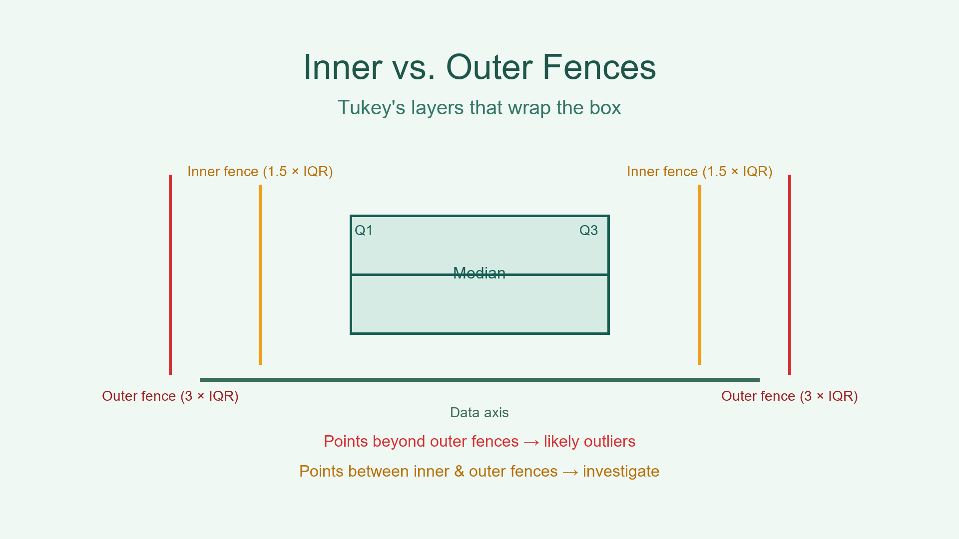
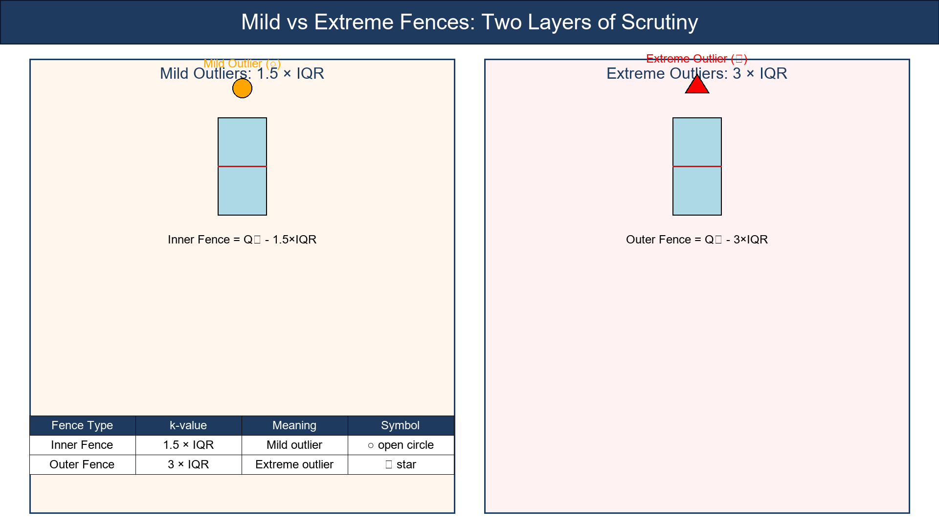
Variants: Mild vs. Extreme Fences
Tukey suggested two layers of scrutiny:
| Fence Type | k-value | Meaning | Typical Symbol | |------------|---------|---------|----------------| | Inner Fence | 1.5 × IQR | Mild outlier | open circle | | Outer Fence | 3 × IQR | Extreme outlier | star |
This gives you nuance — not every far-off point is a villain; some are just adventurous.
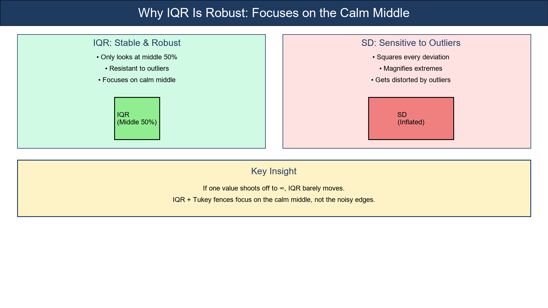
Why IQR Is Robust
Unlike the standard deviation, which squares every deviation (magnifying extremes), the IQR only looks at the middle 50%.
So if one value shoots off to ∞, IQR barely moves.
That's why the IQR + Tukey fences are robust — they focus on the calm middle, not the noisy edges.
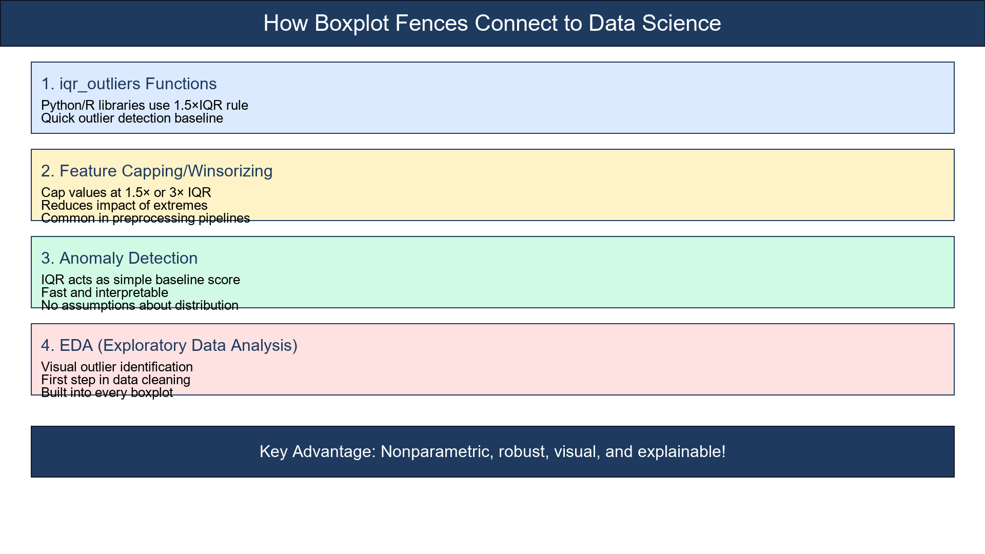
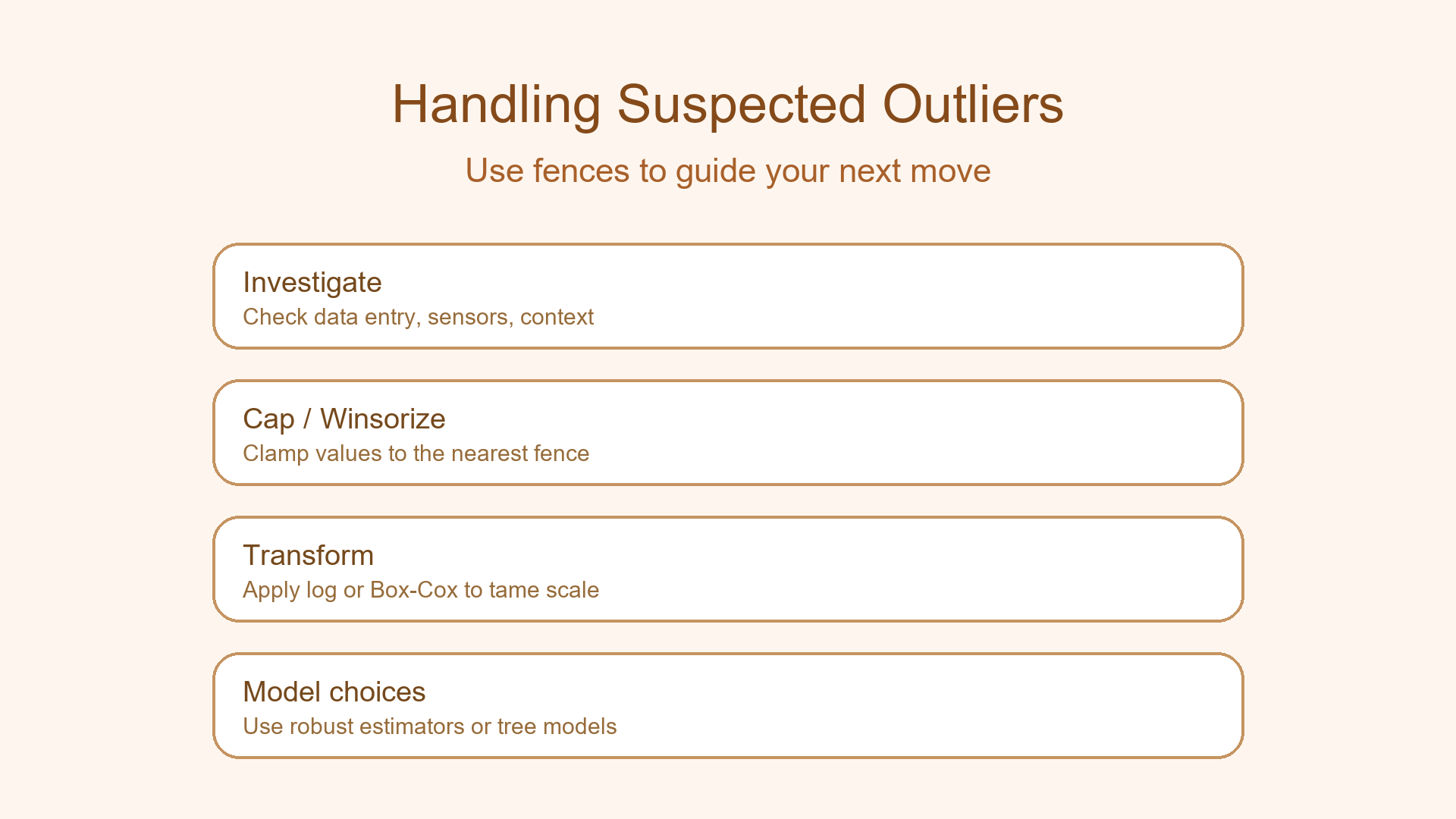
How It Connects to Data Science
Boxplot fences are the conceptual ancestor of many robust methods:
iqr_outliersfunctions in Python/R use the same fence logic.- Feature capping/winsorizing often uses 1.5× or 3× IQR rules.
- In anomaly detection, IQR acts as a simple yet reliable baseline score.
In short: if you've drawn a boxplot, you've already done outlier detection!
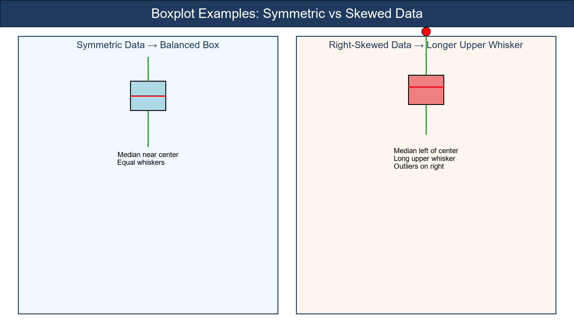
Visual Idea
Show a clean boxplot with labeled parts:
- Median line
- Box edges (Q₁ & Q₃)
- Whiskers (fences)
- Dots for outliers
Use two examples:
-
Symmetric data → balanced box
-
Right-skewed data → longer upper whisker
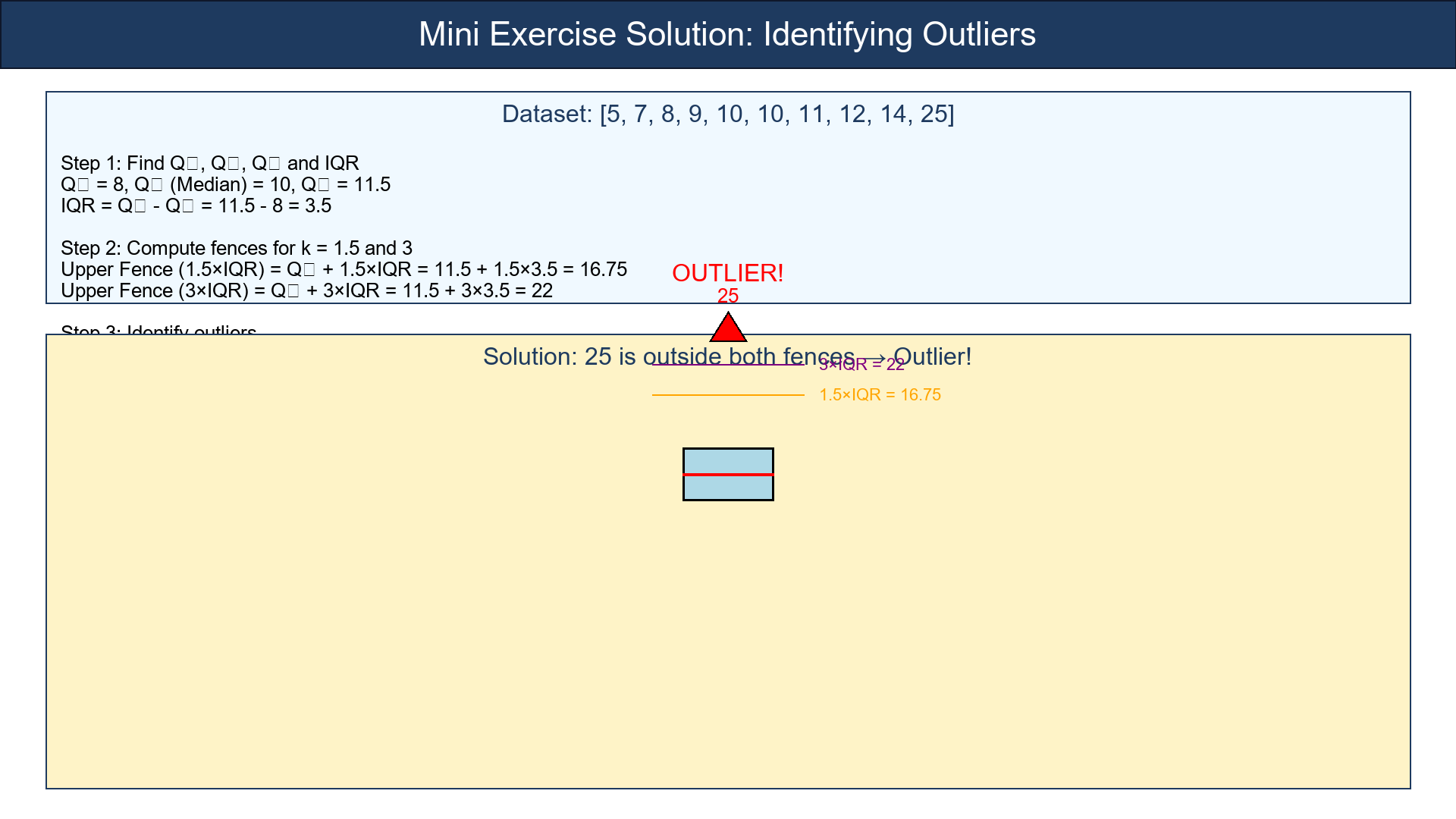
Try It Yourself — Mini Exercise
Dataset:
[5, 7, 8, 9, 10, 10, 11, 12, 14, 25]
1. Find Q₁, Q₂, Q₃ and IQR.
2. Compute the fences for k = 1.5 and 3.
3. Which points fall outside each?
(Hint: 25 might raise some eyebrows )
What to remember
- Boxplots = a picture of the middle + the fences around it.
- IQR = robust measure of spread.
- Tukey fences = simple, nonparametric outlier rule.
- Visual + mathematical + explainable = the perfect first step in outlier analysis.
Boxplots don't just summarize data — they protect you from its surprises.
References
-
Tukey, J. W. (1977). Exploratory Data Analysis. Addison-Wesley.
-
McGill, R., Tukey, J. W., & Larsen, W. A. (1978). Variations of box plots. The American Statistician, 32(1), 12-16.
-
Frigge, M., Hoaglin, D. C., & Iglewicz, B. (1989). Some implementations of the boxplot. The American Statistician, 43(1), 50-54.
-
Rousseeuw, P. J., & Croux, C. (1993). Alternatives to the median absolute deviation. Journal of the American Statistical Association, 88(424), 1273-1283.
-
Leys, C., Ley, C., Klein, O., Bernard, P., & Licata, L. (2013). Detecting outliers: Do not use standard deviation around the mean, use absolute deviation around the median. Journal of Experimental Social Psychology, 49(4), 764-766.
-
Barnett, V., & Lewis, T. (1994). Outliers in Statistical Data (3rd ed.). John Wiley & Sons.
Quick Recap
Boxplots are the simplest visual way to spot outliers.
They rely on the IQR (Interquartile Range) — the middle 50% of your data — and build "fences" around it:
Points outside these fences are suspected outliers.
It's simple, robust, and doesn't assume your data are Normal.