Day 8 — Adjusted Boxplot & Medcouple
Taming skewed distributions without crying wolf on legitimate extremes.
Introduction
Regular boxplots assume symmetric data, so a long tail looks suspicious. Real-world datasets—salaries, housing prices, reaction times—are often skewed. The adjusted boxplot fixes this by combining Tukey-style fences with the medcouple, a robust skewness statistic.
The quick version:
- Medcouple measures skewness on a scale from −1 → +1.
- Adjusted fences use exponential factors so the long tail gets extra space.
- Positively skewed data widens the upper fence and tightens the lower fence (and vice versa).
- Use adjusted boxplots when histograms look lopsided or domain knowledge says “long tail is normal”.
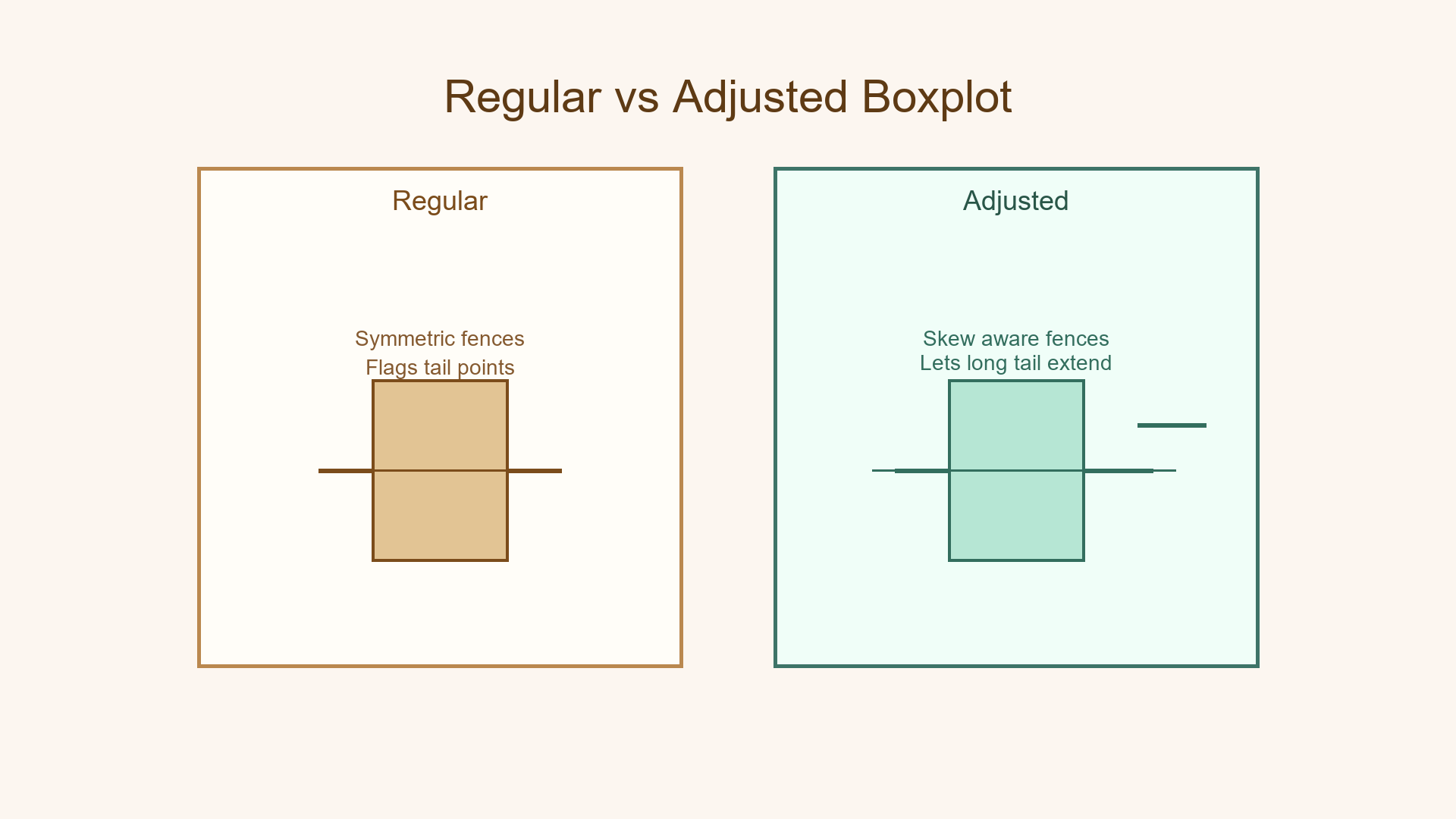
The Problem with Regular Boxplots
Imagine company salaries: most lie between ₹40k–₹80k, yet one executive earns ₹1600k. A traditional boxplot calls that an outlier because it places equal weight on both tails. The result: normal tail behavior is mislabelled as noise.
Why symmetric fences fail
- Traditional fences:
Lower = Q₁ − 1.5 × [IQR](/key)andUpper = Q₃ + 1.5 × IQR - Works brilliantly when the distribution is balanced.
- Breaks when a tail is naturally long—think incomes, clicks, insurance claims.
Regular boxplots think "extreme on either side" is equally likely; skewed data disagrees.
How the Adjusted Boxplot Fixes This
The adjusted boxplot tweaks Tukey's fences with an exponential factor driven by the medcouple. More skew means more asymmetry in the allowable range.
Smart guard analogy
- Regular guard: “Tall or short? Either way you look suspicious.”
- Adjusted guard: “Most folks are tall today; short people stand out more than tall ones.”
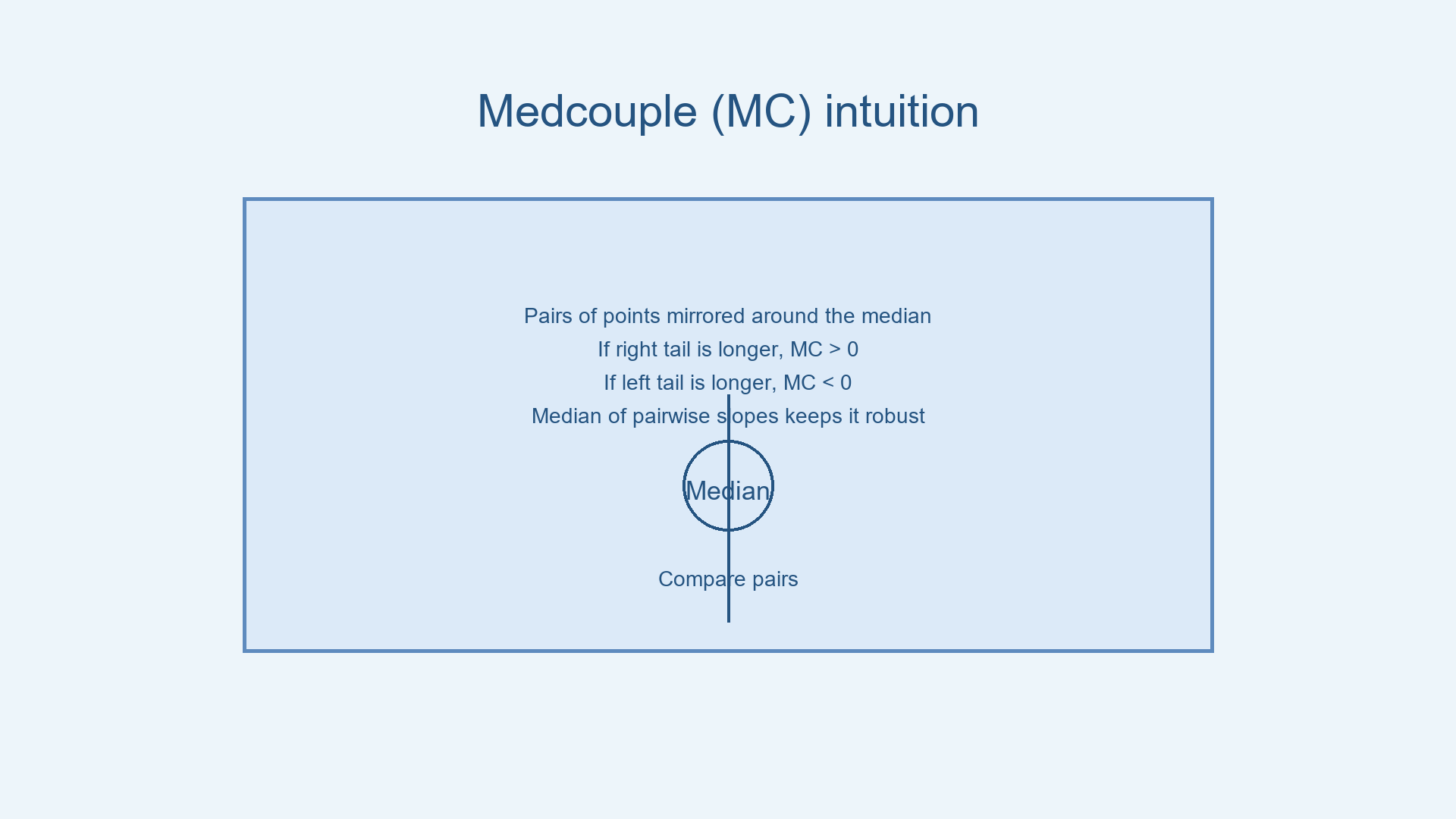
Meet the Medcouple (MC)
The medcouple is a robust skewness statistic that compares symmetric pairs around the median. It ignores extreme values and captures how one tail spreads relative to the other.
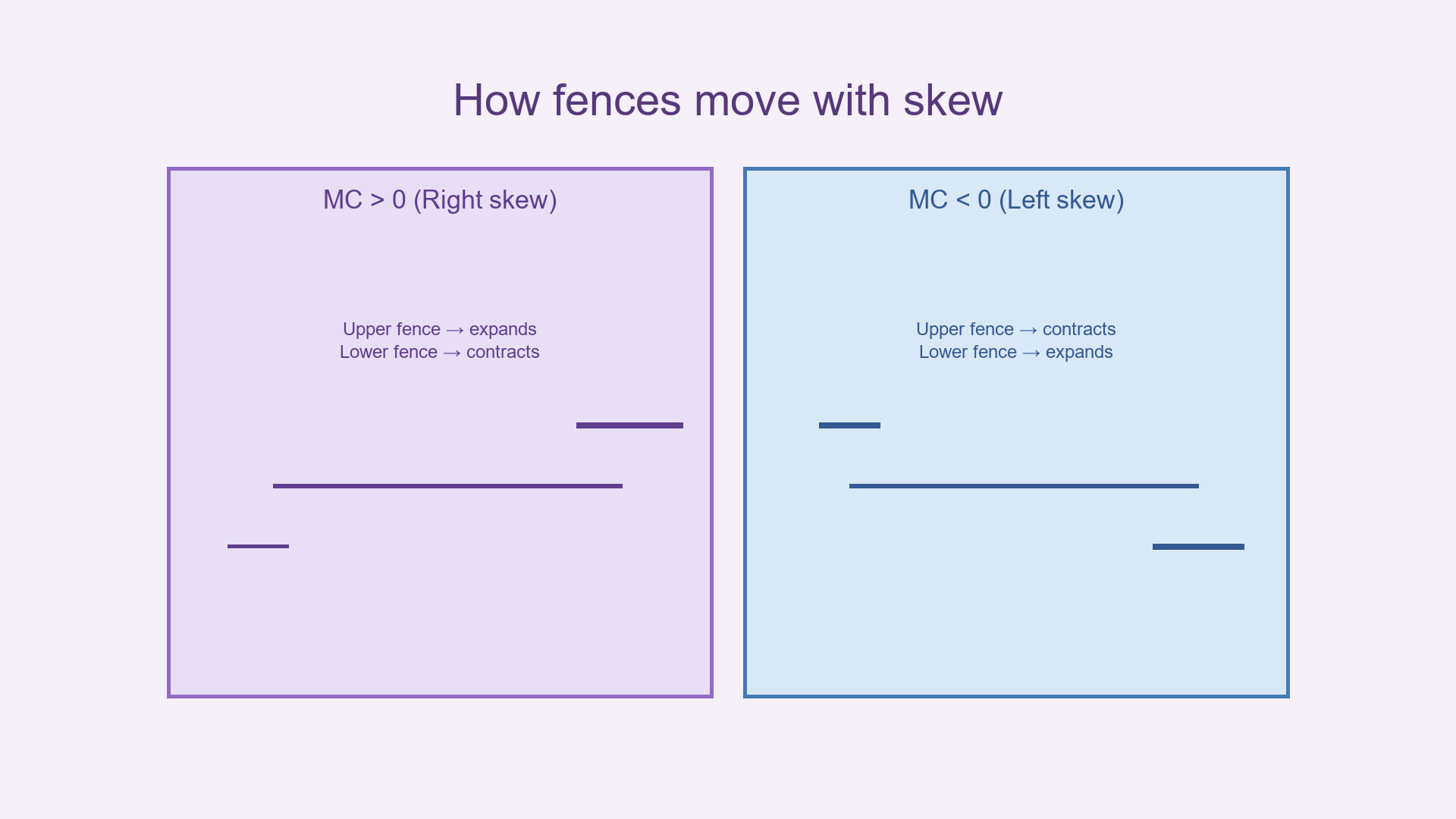
MC ≈ 0→ roughly symmetric.MC > 0→ positively skewed (long right tail).MC < 0→ negatively skewed (long left tail).
MC = median of h(xᵢ, x)

where h(xᵢ, x) = ((x - median) - (median - xᵢ)) / (x - xᵢ)
How the Adjusted Fences Work
Traditional fences use a fixed multiplier. Adjusted fences multiply 1.5 × IQR by an exponential function of the medcouple:
Lower fence = Q₁ − 1.5 × exp(−3.5 × MC) × [IQR](/key)
Upper fence = Q₃ + 1.5 × exp(+4.0 × MC) × [IQR](/key)
- Positive MC (right skew):
exp(+4.0 × MC)explodes, stretching the upper fence;exp(−3.5 × MC)shrinks, tightening the lower fence. - Negative MC (left skew): the behavior flips—lower fence loosens, upper fence tightens.
Worked Example — House Prices
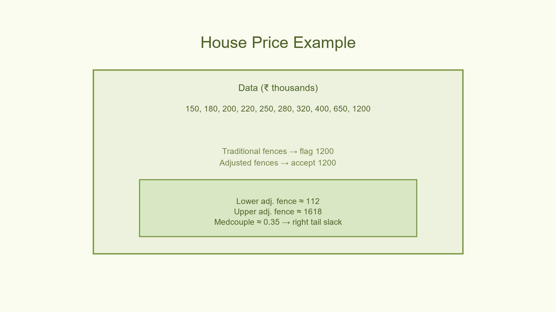
Dataset (₹ in thousands): [150, 180, 200, 220, 250, 280, 320, 400, 650, 1200]
[Q₁](/key) = 200,  [Q₂](/key) = 265,  [Q₃](/key) = 400
[IQR](/key) = 200
Medcouple ≈ 0.35 (right skew)
Traditional fences
Lower = 200 − 1.5 × 200 = −100
Upper = 400 + 1.5 × 200 = 700 → flags 1200 as an outlier
Adjusted fences
Lower = 200 − 1.5 × exp(−3.5 × 0.35) × 200 ≈ 112
Upper = 400 + 1.5 × exp(4.0 × 0.35) × 200 ≈ 1618
No outliers detected — the long right tail is normal for property values.
Pseudocode Implementation
Show code (10 lines)
def adjusted_boxplot_outliers(data):
Q1, Q3 = compute_quartiles(data)
IQR = Q3 - Q1
MC = compute_medcouple(data)

lower = Q1 - 1.5 * math.exp(-3.5 * MC) * IQR
upper = Q3 + 1.5 * math.exp(4.0 * MC) * IQR

return [x for x in data if x < lower or x > upper]
When to Switch Boxplots
Use adjusted boxplots when:
- Histograms or density plots reveal skewness.
- Domain knowledge screams “long tail is normal” (salaries, prices, insurance claims).
- Traditional boxplots call too many valid values outliers.
Stick with regular boxplots when:
- Data is roughly symmetric or sample size is tiny (<20).
- You need a quick-and-dirty check for any extreme value.
The essentials
- The medcouple captures skewness without being tricked by outliers.
- Adjusted boxplots expand and contract fences intelligently.
- Long tails stop masquerading as anomalies; true anomalies still pop.
Where This Shows Up
Adjusted boxplots are widely used in financial risk analysis, where asset return distributions are notoriously right-skewed. Insurance companies rely on them to set claim thresholds without flagging legitimate high-cost events as anomalies. In biomedical research, skewed biomarker concentrations benefit from medcouple-adjusted fences to avoid discarding valid patient readings.
References
-
Brys, G., Hubert, M., & Struyf, A. (2004). A robust measure of skewness. Journal of Computational and Graphical Statistics, 13(4), 996–1017.
-
Rousseeuw, P. J., & Hubert, M. (2011). Robust statistics for outlier detection. Wiley Interdisciplinary Reviews: Data Mining and Knowledge Discovery, 1(1), 73–79.
-
Hubert, M., & Vandervieren, E. (2008). An adjusted boxplot for skewed distributions. Computational Statistics & Data Analysis, 52(12), 5186–5201.
-
Tukey, J. W. (1977). Exploratory Data Analysis. Addison-Wesley.
-
Hoaglin, D. C., Mosteller, F., & Tukey, J. W. (Eds.). (1983). Understanding Robust and Exploratory Data Analysis. John Wiley & Sons.
-
Rousseeuw, P. J., & Croux, C. (1993). Alternatives to the median absolute deviation. Journal of the American Statistical Association, 88(424), 1273–1283.
-
Hampel, F. R. (1974). The influence curve and its role in robust estimation. Journal of the American Statistical Association, 69(346), 383–393.
-
Barnett, V., & Lewis, T. (1994). Outliers in Statistical Data (3rd ed.). John Wiley & Sons.
-
Maronna, R. A., Martin, R. D., & Yohai, V. J. (2006). Robust Statistics: Theory and Methods. John Wiley & Sons.
-
Groeneveld, R. A., & Meeden, G. (1984). Measuring skewness and kurtosis. The Statistician, 33(4), 391–399.
-
Hinkley, D. V. (1975). On power transformations to symmetry. Biometrika, 62(1), 101–111.