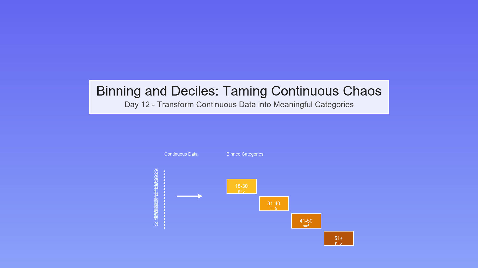
Day 12 — Binning and Deciles: Taming Continuous Chaos
The Overwhelm Problem: Too Many Numbers!
Imagine you're analyzing customer ages and income to predict product effectiveness:
Raw Data (100 customers):
Age: 23.4, 45.7, 31.2, 52.8, 38.9, 41.3, 29.7, ...

Income: $43,200, $87,500, $52,300, $91,800, ...
Question: How does effectiveness vary by age and income?
Problem: With 100 unique ages and 100 unique incomes, you have 100 × 100 = 10,000 possible combinations! You can't make sense of this!
Solution: BINNING! Group continuous values into meaningful buckets.
What is Binning?
Binning (also called discretization) means converting continuous numbers into categorical groups.
Visual Transformation
Before (Continuous):
Ages: 23, 24, 25, 26, 27, 28, 29, 30, 31, 32, ...

↓  ↓  ↓  ↓  ↓  ↓  ↓  ↓  ↓  ↓

Too many individual values!
After (Binned):
Age Groups: [18-30], [31-40], [41-50], [51-60], [61+]

Young   Young    Middle   Middle   Senior

Adult    Age      Age
Benefits:
Easier to understand ("30s vs 40s")
Reveals patterns ("effectiveness higher in 40s")
Reduces noise (smooths out random variation)
Creates interpretable tables and charts
Types of Binning
1. Equal-Width Binning (Fixed Intervals)
Divide the range into bins of equal size.
Example: Ages from 20 to 80
Show code (12 lines)
Bin 1: [20-30)  ← 10 years wide

Bin 2: [30-40)  ← 10 years wide

Bin 3: [40-50)  ← 10 years wide

Bin 4: [50-60)  ← 10 years wide

Bin 5: [60-70)  ← 10 years wide

Bin 6: [70-80]  ← 10 years wide
Formula:
Bin width = (max - min) / number_of_bins

Bin edges = [min, min + width, min + 2×width, ..., max]
Pros:
-
Simple, intuitive
-
Equal-sized ranges
Cons:
-
Bins can have very different counts
-
Sensitive to outliers (one extreme value stretches everything)
2. Equal-Frequency Binning (Quantiles/Deciles)
Divide data so each bin has approximately the same number of observations.
Example: 100 ages, want 5 bins
Show code (12 lines)
Bin 1: [20-28]  ← 20 people

Bin 2: [29-35]  ← 20 people

Bin 3: [36-42]  ← 20 people

Bin 4: [43-52]  ← 20 people

Bin 5: [53-80]  ← 20 people

Notice: Bin widths vary, but counts are equal!
Special Cases:
-
Quartiles: 4 bins (25% each) - Q₁, Q₂, Q₃, Q₄
-
Quintiles: 5 bins (20% each)
-
Deciles: 10 bins (10% each) Most common!
-
Percentiles: 100 bins (1% each)
Pros:
-
Each bin has enough data for reliable statistics
-
Not affected by outliers
-
Great for comparing "top 10%" vs "bottom 10%"
Cons:
-
Bin widths can be confusing (why is one bin 5 years and another 15?)
-
Ties can make exact equal frequencies impossible
3. Custom Binning (Domain-Driven)
Create bins based on real-world meaning.
Example: Credit scores
Show code (10 lines)
[300-579]: Poor

[580-669]: Fair

[670-739]: Good

[740-799]: Very Good

[800-850]: Excellent
Example: Age groups
Show code (12 lines)
[0-12]:   Child

[13-17]:  Teen

[18-25]:  Young Adult

[26-40]:  Adult

[41-60]:  Middle Age

[61+]:    Senior
Pros:
-
Makes business sense
-
Easy to communicate
-
Aligns with existing categories
Cons:
-
Requires domain expertise
-
May not have equal counts
Deciles: The Star of the Show
Deciles divide your data into 10 equal-frequency bins, each containing 10% of observations.
Why Deciles?
-
Balance: Enough bins to see patterns, not so many you lose interpretability
-
Statistical Power: Each bin has ≥10% of data (reliable estimates)
-
Industry Standard: Used in credit scoring, risk modeling, marketing
-
Percentile Friendly: Decile 10 = top 10%, easy to explain!
The Math Behind Deciles
For n observations, sorted from smallest to largest:
Show code (10 lines)
Decile 1: Observations 1 to n/10        (0-10th percentile)

Decile 2: Observations n/10 to 2n/10    (10-20th percentile)

Decile 3: Observations 2n/10 to 3n/10   (20-30th percentile)

...

Decile 10: Observations 9n/10 to n      (90-100th percentile)
Decile boundaries (cut points):
Show code (10 lines)
D₁ = 10th percentile

D₂ = 20th percentile

D₃ = 30th percentile

...

D₉ = 90th percentile
Example Calculation
Data: [10, 15, 18, 22, 25, 30, 35, 40, 50, 60] (n=10)
Want: Deciles (10 bins, 1 obs each ideally)
Step 1: Already sorted
Step 2: Calculate decile positions
Position for k-th decile = k × (n+1) / 10

D₁ position = 1 × 11/10 = 1.1 → between 1st and 2nd obs

D₂ position = 2 × 11/10 = 2.2 → between 2nd and 3rd obs

...
Step 3: Interpolate if needed
D₁ = 10 + 0.1×(15-10) = 10.5

D₂ = 15 + 0.2×(18-15) = 15.6

D₃ = 18 + 0.3×(22-18) = 19.2

...
Step 4: Assign observations to deciles
Show code (20 lines)
Decile 1: [10]        (≤10.5)

Decile 2: [15]        (10.5-15.6)

Decile 3: [18]        (15.6-19.2)

Decile 4: [22]        (19.2-23.4)

Decile 5: [25]        (23.4-27.5)

Decile 6: [30]        (27.5-32.5)

Decile 7: [35]        (32.5-37.5)

Decile 8: [40]        (37.5-45.0)

Decile 9: [50]        (45.0-55.0)

Decile 10: [60]       (>55.0)
Each decile has exactly 1 observation!
Exercise: Proving Deciles Equalize Counts
Claim: In the ideal case (no ties), each decile contains exactly n/10 observations.
Proof:
Setup:
-
n observations: x₁, x₂, ..., xₙ (sorted)
-
All values distinct (no ties)
-
Want to divide into 10 bins of equal size
Method:
-
Calculate decile boundaries at percentiles: 10, 20, 30, ..., 90
-
Each boundary falls at position k×n/10 for k=1,2,...,9
Observation count per decile:
Show code (10 lines)
Decile 1: Positions 1 to n/10           → n/10 observations

Decile 2: Positions n/10+1 to 2n/10     → n/10 observations

Decile 3: Positions 2n/10+1 to 3n/10    → n/10 observations

...

Decile 10: Positions 9n/10+1 to n       → n/10 observations
Total check:
Sum = 10 × (n/10) = n

All observations accounted for!
Example with n=100:
Show code (12 lines)
Decile 1: Obs 1-10     → 10 obs

Decile 2: Obs 11-20    → 10 obs

Decile 3: Obs 21-30    → 10 obs

...

Decile 10: Obs 91-100  → 10 obs

Total = 10×10 = 100
What About Ties?
Problem: If multiple observations have the same value, decile boundaries may fall "in the middle" of a tie group.
Example:
Show code (10 lines)
Data: [10, 20, 20, 20, 20, 30, 40, 50, 60, 70]

↑________↑

Tied values

Want decile 2 boundary at 20th percentile (position 2)

But positions 2, 3, 4, 5 all equal 20!
Solutions:
- Lower boundary: Put tied values in lower decile
-
Decile 1: [10, 20, 20, 20, 20] → 5 obs
-
Decile 2: [30] → 1 obs
-
Result: Unequal counts
- Upper boundary: Put tied values in upper decile
-
Decile 1: [10] → 1 obs
-
Decile 2: [20, 20, 20, 20, 30] → 5 obs
-
Result: Still unequal
- Random assignment: Randomly assign tied values
-
Decile 1: [10, 20, 20] → 3 obs (random)
-
Decile 2: [20, 20, 30] → 3 obs (random)
-
Result: Non-deterministic
- Accept it: Ties cause slight imbalance, that's life!
-
Document the issue
-
Usually not a big deal in practice
In practice: Most statistical software uses method 4 (accept slight imbalance). With large datasets and continuous variables, ties are rare anyway!
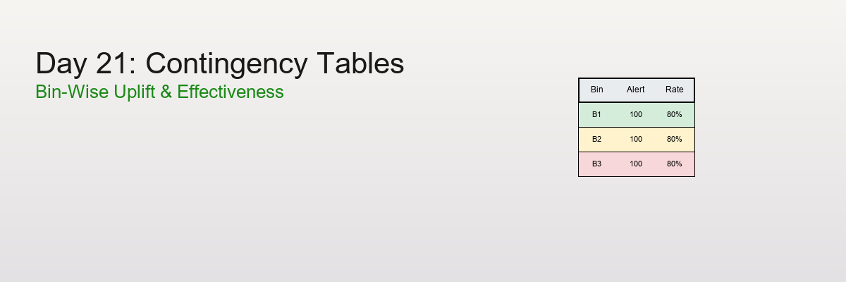
Contingency Tables (Cross-Tabs): The Power Duo
Once you bin two variables, you can create a contingency table (also called cross-tab) showing how they interact.
Setup
Variables:
-
Age (binned into 5 groups)
-
Income (binned into 5 groups)
-
Outcome: Effective (Yes/No)
Simple Frequency Table
Question: How many people in each age group?
Show code (18 lines)
Age Group    | Count | Percent

-------------|-------|--------

18-30        |   25  |  25%

31-40        |   30  |  30%

41-50        |   20  |  20%

51-60        |   15  |  15%

61+          |   10  |  10%

-------------|-------|--------

Total        |  100  | 100%
Code:
Show code (11 lines)
import pandas as pd

# Create bins
age_bins = [18, 30, 40, 50, 60, 100]
age_labels = ['18-30', '31-40', '41-50', '51-60', '61+']
df['age_group'] = pd.cut(df['age'], bins=age_bins, labels=age_labels)

# Frequency table
frequency_table = df['age_group'].value_counts().sort_index()
print(frequency_table)
Cross-Tab: Two Variables
Question: How does effectiveness vary by age AND income?
Show code (16 lines)
Income Group

Low    Medium   High

Age    18-30   12      8       5     (25 total)

Group  31-40   10     12       8     (30 total)

41-50    6      8       6     (20 total)

51-60    4      7       4     (15 total)

61+      3      4       3     (10 total)

Column Total   35     39      26    (100 total)
Interpretation:
-
Young people spread across income levels
-
Middle-aged concentrated in medium income
-
Seniors fewer overall
Code:
Show code (9 lines)
# Create income bins
income_bins = [0, 40000, 70000, 150000]
income_labels = ['Low', 'Medium', 'High']
df['income_group'] = pd.cut(df['income'], bins=income_bins, labels=income_labels)

# Cross-tab
crosstab = pd.crosstab(df['age_group'], df['income_group'])
print(crosstab)
Per-Bin Rate Estimates: Finding the Signal
The real power comes when we calculate rates (percentages) within each bin.
Setup
Goal: Calculate "Percent Effective" for each age-income combination
Formula:
Percent Effective in bin = (# Effective in bin / Total in bin) × 100%
Example Calculation
Age 18-30, Income Low:
-
Total in bin: 12 people
-
Effective: 8 people
-
Percent Effective: 8/12 = 66.7%
Age 51-60, Income High:
-
Total in bin: 4 people
-
Effective: 3 people
-
Percent Effective: 3/4 = 75.0%
Full Cross-Tab with Rates
Show code (20 lines)
Percent Effective by Age and Income

Income Group

Low      Medium    High

Age    18-30  66.7%    62.5%    60.0%

Group  31-40  70.0%    75.0%    87.5%  ← Peak!

41-50  66.7%    75.0%    83.3%

51-60  50.0%    71.4%    75.0%

61+    33.3%    50.0%    66.7%

Insight: Effectiveness peaks for 31-40 age group

with high income!
Code:
Show code (12 lines)
# Add effectiveness column (0 or 1)
df['effective'] = df['outcome'].map({'Yes': 1, 'No': 0})

# Calculate rates
rate_table = df.groupby(['age_group', 'income_group'])['effective'].agg([
('count', 'size'),
('effective_count', 'sum'),
('percent_effective', lambda x: x.mean() * 100)
])

print(rate_table)
Heatmaps: The Visual Payoff
Heatmaps turn cross-tabs into beautiful, intuitive visuals.
Count Heatmap 🟦
Shows how many observations in each cell.
Show code (18 lines)
Income

Low  Med  High

Age 30   🟦  🟦   🟦    (12, 8, 5)

40   🟦  🟦   🟦    (10, 12, 8)

50   🟨  🟦   🟨    (6, 8, 6)

60   🟨  🟨   🟨    (4, 7, 4)

70   🟨  🟨   🟨    (3, 4, 3)

🟦 = Many observations (>8)

🟨 = Few observations (<6)
Insight: Data concentrated in younger age groups.
Percent Effective Heatmap
Shows effectiveness rate in each cell.
Show code (20 lines)
Income

Low   Med   High

Age 30  67%   63%   60%    🟨

40  70%   75%   88%    🟥 ← Hotspot!

50  67%   75%   83%    🟧

60  50%   71%   75%    🟧

70  33%   50%   67%    🟨

🟥 = High effectiveness (>80%)

🟧 = Medium (65-80%)

🟨 = Low (<65%)
Insight: Target 31-40 age group with high income for best results!
Code:
Show code (16 lines)
import seaborn as sns
import matplotlib.pyplot as plt

# Pivot for heatmap
heatmap_data = rate_table['percent_effective'].unstack()

# Create heatmap
plt.figure(figsize=(8, 6))
sns.heatmap(heatmap_data, annot=True, fmt='.1f', cmap='RdYlGn',
cbar_kws={'label': 'Percent Effective'})
plt.title('Treatment Effectiveness by Age and Income')
plt.xlabel('Income Group')
plt.ylabel('Age Group')
plt.tight_layout()
plt.show()
Tie-Back: get_cross_tab in Our Toolkit
Show code (78 lines)
def get_cross_tab(df, row_var, col_var, value_var,
row_bins=None, col_bins=None, aggfunc='mean'):
"""
Create cross-tab with optional binning

Parameters:
- df: DataFrame
- row_var: Variable for rows (will be binned if row_bins provided)
- col_var: Variable for columns (will be binned if col_bins provided)
- value_var: Variable to aggregate (e.g., 'effective')
- row_bins: Number of bins or list of bin edges for rows
- col_bins: Number of bins or list of bin edges for columns
- aggfunc: Aggregation function ('mean', 'sum', 'count')

Returns:
- crosstab: Pivot table
- heatmap: matplotlib figure
"""
df_copy = df.copy()

# Bin row variable if needed
if row_bins is not None:
if isinstance(row_bins, int):
# Use quantile bins (deciles, quartiles, etc.)
df_copy[f'{row_var}_binned'] = pd.qcut(
df[row_var], q=row_bins, labels=False, duplicates='drop'
)
else:
# Use custom bin edges
df_copy[f'{row_var}_binned'] = pd.cut(
df[row_var], bins=row_bins
)
row_var = f'{row_var}_binned'

# Bin column variable if needed
if col_bins is not None:
if isinstance(col_bins, int):
df_copy[f'{col_var}_binned'] = pd.qcut(
df[col_var], q=col_bins, labels=False, duplicates='drop'
)
else:
df_copy[f'{col_var}_binned'] = pd.cut(
df[col_var], bins=col_bins
)
col_var = f'{col_var}_binned'

# Create cross-tab
if aggfunc == 'mean':
crosstab = df_copy.pivot_table(
values=value_var,
index=row_var,
columns=col_var,
aggfunc='mean'
) * 100  # Convert to percentage
title = f'Percent {value_var.title()}'
elif aggfunc == 'count':
crosstab = pd.crosstab(df_copy[row_var], df_copy[col_var])
title = 'Count'
else:
crosstab = df_copy.pivot_table(
values=value_var,
index=row_var,
columns=col_var,
aggfunc=aggfunc
)
title = f'{aggfunc.title()} of {value_var.title()}'

# Create heatmap
fig, ax = plt.subplots(figsize=(10, 6))
sns.heatmap(crosstab, annot=True, fmt='.1f', cmap='RdYlGn',
ax=ax, cbar_kws={'label': title})
ax.set_title(f'{title} by {row_var.title()} and {col_var.title()}')
ax.set_xlabel(col_var.title())
ax.set_ylabel(row_var.title())
plt.tight_layout()

return crosstab, fig
Usage:
Show code (24 lines)
# Example 1: Deciles (10 bins each)
crosstab, fig = get_cross_tab(
df,
row_var='age',
col_var='income',
value_var='effective',
row_bins=10,  # Age deciles
col_bins=10,  # Income deciles
aggfunc='mean'
)

# Example 2: Custom bins
age_bins = [18, 30, 40, 50, 60, 100]
income_bins = [0, 40000, 70000, 150000]
crosstab, fig = get_cross_tab(
df,
row_var='age',
col_var='income',
value_var='effective',
row_bins=age_bins,
col_bins=income_bins,
aggfunc='mean'
)
Common Pitfalls and Best Practices
Pitfall 1: Too Many Bins
Problem:
10 age bins × 10 income bins = 100 cells

With 100 observations, average 1 per cell!

Rates unreliable, heatmap noisy.
Solution: Use 3-5 bins per variable (max 25 cells total)
Pitfall 2: Too Few Bins
Problem:
2 age bins × 2 income bins = 4 cells

Loses all nuance, everything averaged out!
Solution: At least 3 bins per variable to see patterns
Pitfall 3: Unequal Sample Sizes
Problem:
Cell A: 50 obs, 40% effective (reliable )

Cell B: 2 obs, 100% effective (luck! )
Solution:
-
Report sample sizes alongside rates
-
Use confidence intervals for small cells
-
Consider merging small bins
Pitfall 4: Ignoring Statistical Significance
Problem:
Age 18-30: 60% effective

Age 31-40: 65% effective

Is 5% difference real or random?
Solution: Use chi-square test or proportion tests
Code:
Show code (11 lines)
from scipy.stats import chi2_contingency

# Test if age and effectiveness are independent
contingency_table = pd.crosstab(df['age_group'], df['effective'])
chi2, p_value, dof, expected = chi2_contingency(contingency_table)

if p_value < 0.05:
print("Relationship is statistically significant!")
else:
print("Could be random chance.")
Best Practices
1. Start with Deciles
-
Industry standard
-
Good balance of detail and interpretability
-
Each bin has 10% of data (reliable stats)
2. Check Sample Sizes
Always show counts alongside rates:
Age 31-40, High Income: 87.5% effective (n=8)

↑

Don't ignore this!
3. Use Color Wisely
-
Green → Good (high effectiveness)
-
Red → Bad (low effectiveness)
-
Avoid rainbow (hard to interpret)
4. Label Clearly
Good: "Percent Effective by Age Decile and Income Quartile"

Bad:  "Heatmap"
5. Document Bin Choices
Show code (9 lines)
# Document your binning
"""
Age bins: Deciles (10% each)

Income bins: Quartiles (25% each)

Rationale: Age has wider range, needs more granularity
"""
6. Validate Patterns
-
Does the pattern make sense?
-
Age 31-40 most effective? Check if that age group is healthiest, most compliant, etc.
-
Don't just report numbers, explain them!
When to Use Binning
Perfect For:
Exploratory Analysis: "Where are the patterns?"
Communication: Easier than scatter plots for stakeholders
Risk Modeling: Credit scores, insurance premiums
A/B Testing: Segment analysis (young vs old users)
Feature Engineering: Convert continuous → categorical for tree models
Don't Use When:
Sample size too small (n < 50): Bins will be unreliable
Relationships are smooth/linear: Binning loses information
Need exact predictions: Binning discretizes, loses precision
Variables naturally categorical: No need to bin "Country" or "Gender"
Summary
Binning transforms overwhelming continuous data into digestible insights:
Key Concepts:
Equal-width bins: Fixed intervals (simple but sensitive to outliers)
Equal-frequency bins (deciles): Same count per bin (robust, fair)
Deciles specifically: 10 bins, 10% each - the gold standard
Contingency tables: Cross-tabs show interaction between two binned variables
Per-bin rates: Calculate percentages within each cell
Heatmaps: Visual representation of cross-tabs (color = value)
Ties: Can make perfect equal-frequency binning impossible (accept slight imbalance)
The Decile Proof:
n observations ÷ 10 bins = n/10 per bin (when no ties)

Total = 10 × (n/10) = n
Workflow:
-
Bin continuous variables (deciles usually best)
-
Cross-tab to see interactions
-
Calculate rates for the outcome of interest
-
Visualize with heatmaps
-
Interpret and make decisions
Real Impact:
"Customers age 31-40 with high income have 87.5% satisfaction"
Much clearer than: "Satisfaction correlates with age (r=0.23, p=0.04)"
Wrapping Up
Binning transforms overwhelming continuous data into digestible, actionable insights. Master equal-width and equal-frequency binning, understand deciles (10 equal-frequency bins), and create powerful cross-tabs and heatmaps to reveal patterns in your data. When you have too many numbers to make sense of, binning is your organizing principle.
References
-
Tukey, J. W. (1977). Exploratory Data Analysis. Addison-Wesley.
-
Freedman, D., Pisani, R., & Purves, R. (2007). Statistics (4th ed.). W. W. Norton & Company.
-
Hastie, T., Tibshirani, R., & Friedman, J. (2009). The Elements of Statistical Learning: Data Mining, Inference, and Prediction (2nd ed.). Springer.
-
Agresti, A. (2007). An Introduction to Categorical Data Analysis (2nd ed.). Wiley-Interscience.
-
Wickham, H., & Grolemund, G. (2017). R for Data Science: Import, Tidy, Transform, Visualize, and Model Data. O'Reilly Media.
-
McKinney, W. (2017). Python for Data Analysis: Data Wrangling with Pandas, NumPy, and IPython (2nd ed.). O'Reilly Media.