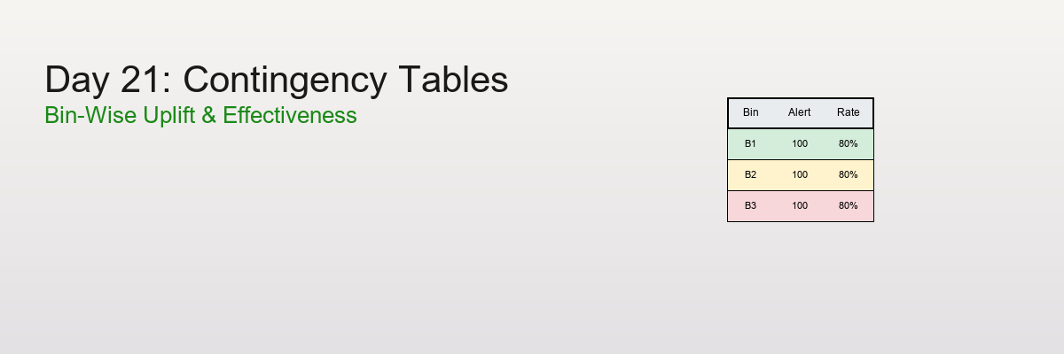
Day 21: Contingency Tables and Bin-Wise Uplift
Quantify uplift and effectiveness across bins and segments. Learn to read contingency tables, calculate bin-wise rates, and avoid the pitfalls of aggregation.
When analyzing the effectiveness of interventions across different segments, simple averages can mislead. Contingency tables and bin-wise analysis reveal the true patterns—and help you avoid Simpson's paradox.
The Problem: Aggregated Metrics Hide Patterns
Scenario: You're analyzing the effectiveness of fraud alerts across different transaction amounts.
Aggregated view:
Overall alerts: 1,000
Overall effective: 600
Overall effectiveness: 60%
But wait! What if effectiveness varies dramatically by transaction amount?
Bin-wise view:
Low amount ($0-$100):     100 alerts, 90 effective → 90%
Medium amount ($100-$500): 400 alerts, 200 effective → 50%
High amount ($500+):       500 alerts, 310 effective → 62%
The insight: The 60% average hides the fact that low-amount transactions have much higher effectiveness!
The question: How do we systematically analyze effectiveness across bins?
What is a Contingency Table?
A contingency table (also called a cross-tabulation or crosstab) is a table that shows the frequency distribution of variables.
Basic Structure
2×2 Contingency Table:
Treatment    Control

Outcome Positive        a          b
Outcome Negative        c          d
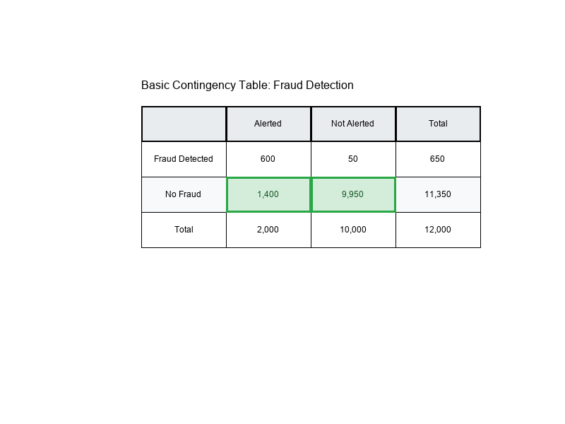
Example: Fraud Alerts
Alerted    Not Alerted

Fraud Detected         600         50
No Fraud             1,400      9,950
Cell Counts
Each cell in the table represents a count:
- a: Treatment + Positive outcome
- b: Control + Positive outcome
- c: Treatment + Negative outcome
- d: Control + Negative outcome
Visual Example:
Rates: Converting Counts to Percentages
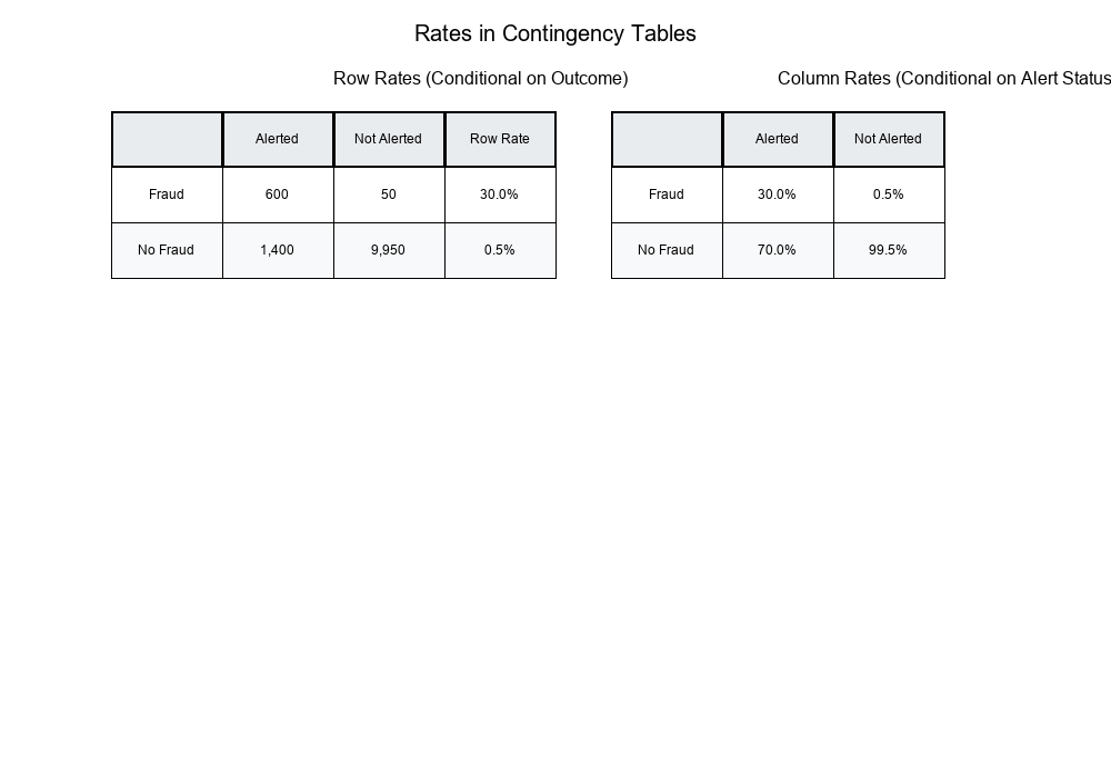
Row Rates (Conditional on Row)
Formula:
Row Rate = Cell Count / Row Total
Example:
Show code (10 lines)
Alerted    Not Alerted    Total

Fraud Detected         600         50         650
No Fraud             1,400      9,950      11,350
Total                2,000     10,000      12,000

Row Rates:
- Fraud Detection Rate (Alerted): 600 / 2,000 = 30%
- Fraud Detection Rate (Not Alerted): 50 / 10,000 = 0.5%
Column Rates (Conditional on Column)
Formula:
Column Rate = Cell Count / Column Total
Example:
Column Rates:
- Alerted → Fraud: 600 / 2,000 = 30%
- Alerted → No Fraud: 1,400 / 2,000 = 70%
- Not Alerted → Fraud: 50 / 10,000 = 0.5%
- Not Alerted → No Fraud: 9,950 / 10,000 = 99.5%
Overall Rates
Formula:
Overall Rate = Total Positive / Grand Total
Example:
Overall Fraud Rate = 650 / 12,000 = 5.4%
Visual Example:
Bin-Wise Uplift: Effectiveness Across Segments
What is Uplift?
Uplift measures the improvement in outcome rate when applying a treatment (intervention) compared to control.
Formula:
Uplift = Treatment Rate - Control Rate
Example:
Treatment (Alerted): 30% fraud detection rate
Control (Not Alerted): 0.5% fraud detection rate
Uplift = 30% - 0.5% = 29.5 percentage points
Bin-Wise Analysis
Problem: Uplift may vary across different segments (bins).
Solution: Calculate uplift separately for each bin.
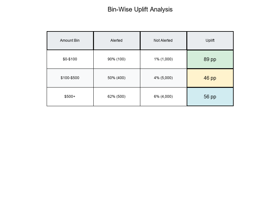
Example: Transaction Amount Bins
Show code (15 lines)
Bin 1: $0-$100
Alerted: 100 alerts, 90 effective → 90%
Not Alerted: 1,000 transactions, 10 fraud → 1%
Uplift: 90% - 1% = 89 percentage points

Bin 2: $100-$500
Alerted: 400 alerts, 200 effective → 50%
Not Alerted: 5,000 transactions, 200 fraud → 4%
Uplift: 50% - 4% = 46 percentage points

Bin 3: $500+
Alerted: 500 alerts, 310 effective → 62%
Not Alerted: 4,000 transactions, 240 fraud → 6%
Uplift: 62% - 6% = 56 percentage points
Key Insight: Low-amount transactions show the highest uplift, even though high-amount transactions have more alerts!
Visual Example:
Marginalization: Aggregating Across Bins
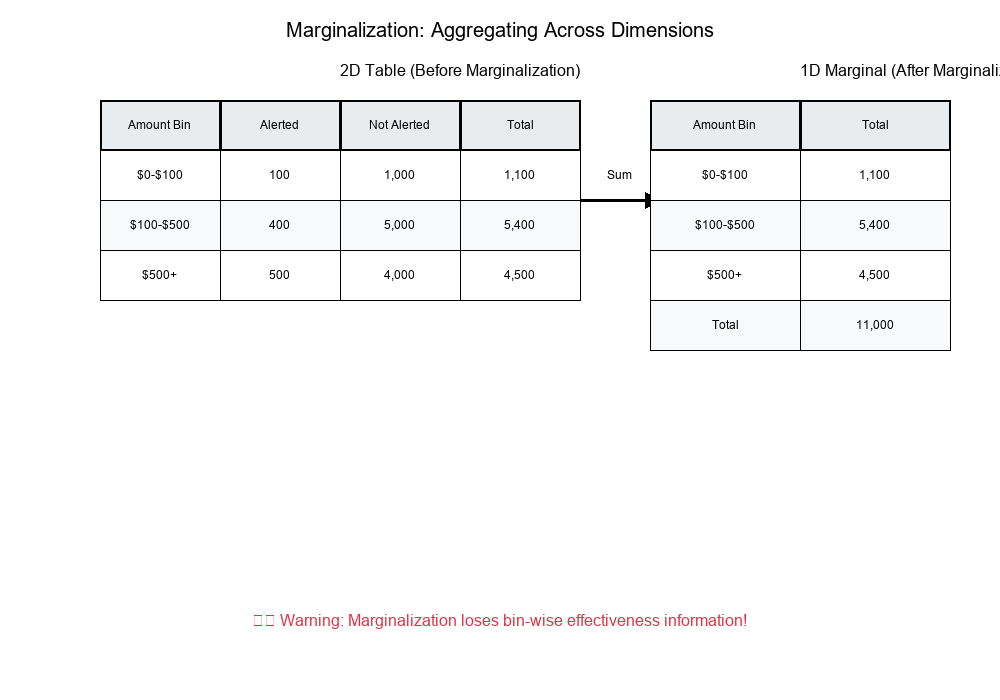
What is Marginalization?
Marginalization is the process of summing across one dimension to get totals.
Example:
Show code (15 lines)
Original 2D Table (Amount × Alert Status):

Alerted    Not Alerted    Total

$0-$100                100        1,000      1,100
$100-$500              400        5,000      5,400
$500+                  500        4,000      4,500
Total                1,000       10,000     11,000

Marginal (Amount only):
$0-$100:     1,100
$100-$500:   5,400
$500+:       4,500
Total:      11,000
The Danger: Losing Information
When you marginalize, you lose the relationship between variables.
Example:
Show code (9 lines)
Before marginalization:
- Can see that $0-$100 has 90% effectiveness
- Can see that $500+ has 62% effectiveness

After marginalization (only totals):
- Only see total alerts: 1,000
- Only see total transactions: 11,000
- Lost the bin-wise effectiveness information!
Visual Example:
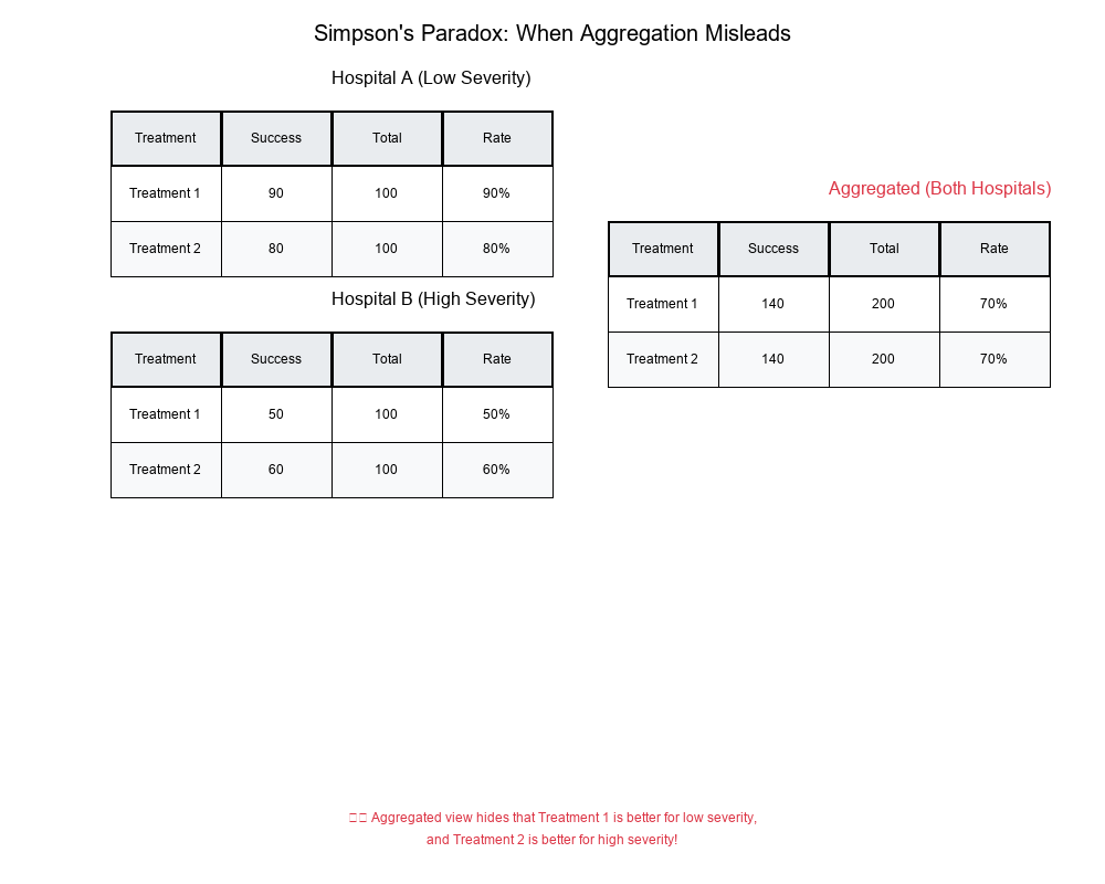
Simpson's Paradox: When Aggregation Misleads
What is Simpson's Paradox?
Simpson's Paradox occurs when a trend appears in different groups but disappears or reverses when the groups are combined.
Classic Example
Scenario: Analyzing success rates of two treatments across two hospitals.
Hospital A:
Treatment 1: 100 patients, 80 success → 80%
Treatment 2: 900 patients, 720 success → 80%
No difference
Hospital B:
Treatment 1: 900 patients, 720 success → 80%
Treatment 2: 100 patients, 80 success → 80%
No difference
Aggregated (Both Hospitals):
Treatment 1: 1,000 patients, 800 success → 80%
Treatment 2: 1,000 patients, 800 success → 80%
No difference
But wait! What if we look at severity?
Hospital A (Low Severity):
Treatment 1: 100 patients, 90 success → 90%
Treatment 2: 100 patients, 80 success → 80%
Treatment 1 is better!
Hospital B (High Severity):
Treatment 1: 100 patients, 50 success → 50%
Treatment 2: 100 patients, 60 success → 60%
Treatment 2 is better!
Aggregated (ignoring severity):
Treatment 1: 200 patients, 140 success → 70%
Treatment 2: 200 patients, 140 success → 70%
No difference - but this hides the true pattern!
Visual Example:
How to Avoid Simpson's Paradox
- Always check bin-wise rates before aggregating
- Look for confounding variables that might explain differences
- Use stratified analysis when you suspect interactions
- Visualize data at multiple levels of aggregation
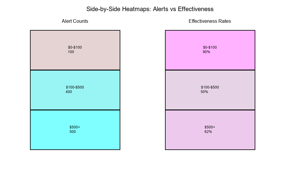
Real-World Application: Heatmaps for Alerts vs Effectiveness
get_frequency_table_1D/2D
These functions create frequency tables for one or two dimensions:
1D Frequency Table:
Amount Bin    Count

$0-$100       1,100
$100-$500     5,400
$500+         4,500
2D Frequency Table:
Amount Bin    Alerted    Not Alerted    Total

$0-$100           100        1,000      1,100
$100-$500         400        5,000      5,400
$500+             500        4,000      4,500
Total           1,000       10,000     11,000
get_effectiveness_trend
This function calculates effectiveness rates across bins:
Output:
Amount Bin    Alerts    Effective    Rate

$0-$100          100         90      90.0%
$100-$500        400        200      50.0%
$500+            500        310      62.0%
Side-by-Side Heatmaps
Visualization: Two heatmaps showing:
- Alert counts by bin
- Effectiveness rates by bin
Purpose: Identify bins where:
- Alerts are high but effectiveness is low
- Alerts are low but effectiveness is high
- Both are high (optimal)
- Both are low (needs attention)
Visual Example:
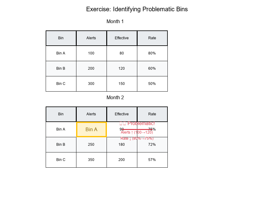
Exercise: Identifying Problematic Bins
The Problem
Question: Identify a bin where alerts grow but percent effective drops.
Data:
Show code (10 lines)
Month 1:
Bin A: 100 alerts, 80 effective → 80%
Bin B: 200 alerts, 120 effective → 60%
Bin C: 300 alerts, 150 effective → 50%

Month 2:
Bin A: 120 alerts, 90 effective → 75%  (alerts ↑, rate ↓)
Bin B: 250 alerts, 180 effective → 72% (alerts ↑, rate ↑)
Bin C: 350 alerts, 200 effective → 57% (alerts ↑, rate ↑)
Solution
Bin A shows the problematic pattern:
- Alerts increased: 100 → 120 (+20%)
- Effectiveness dropped: 80% → 75% (-5 percentage points)
Why this happens:
- More alerts might include lower-quality cases
- Threshold might have been lowered, catching more false positives
- Distribution of cases within the bin might have shifted
Visual Example:
Analysis Steps
- Calculate rates for each bin in each time period
- Compare alert counts (Month 1 vs Month 2)
- Compare effectiveness rates (Month 1 vs Month 2)
- Identify bins where alerts ↑ but rate ↓
- Investigate root causes for those bins
Best Practices for Contingency Table Analysis
1. Always Check Bin-Wise Rates
Don't rely on aggregated metrics alone. Calculate rates for each bin to identify patterns.
2. Use Appropriate Rates
- Row rates: When you want to condition on the row variable
- Column rates: When you want to condition on the column variable
- Overall rates: Only when bins are truly comparable
3. Visualize with Heatmaps
Heatmaps make it easy to spot patterns:
- High/low alert counts
- High/low effectiveness rates
- Relationships between bins
4. Watch for Simpson's Paradox
Always check if aggregated results match bin-wise results. If they don't, investigate!
5. Track Trends Over Time
Monitor how bin-wise rates change over time:
- Are alerts increasing?
- Is effectiveness improving or declining?
- Are there seasonal patterns?
6. Document Your Binning Strategy
Clearly document:
- How bins are defined
- Why these bins matter
- What each bin represents
Summary Table
| Concept | Definition | Use Case |
|---|---|---|
| Contingency Table | Table showing frequency distribution | Organize counts by categories |
| Cell Counts | Raw frequencies in each cell | Base data for calculations |
| Row Rates | Cell count / Row total | Conditional on row variable |
| Column Rates | Cell count / Column total | Conditional on column variable |
| Uplift | Treatment rate - Control rate | Measure intervention effectiveness |
| Marginalization | Summing across dimensions | Aggregate to higher level |
| Simpson's Paradox | Trend reverses when aggregated | Warning: check bin-wise rates! |
Final Thoughts
Contingency tables and bin-wise uplift analysis are powerful tools for understanding effectiveness across segments. They reveal patterns that aggregated metrics hide and help you avoid Simpson's paradox.
Key Takeaways:
Contingency tables organize data into structured frequency distributions Bin-wise analysis reveals patterns hidden in aggregates Uplift quantifies intervention effectiveness Marginalization can hide important relationships Simpson's paradox warns us to check bin-wise rates before aggregating Heatmaps make patterns easy to spot
Always analyze at the right level of granularity!